I have seen many questions where an Excel users want to know more about how to create a Gantt Chart using Time instead of Dates. Here is another example of such a request. The question involved a user that wanted to make a Gantt chart of a weekly schedule to see when someone is working during a 24 hour period in an Excel Chart.
Well this can be done, but you have to take special heed of how Excel handles time in the spreadsheet.
Here is the exact question and give some thought as to how you would handle it:
“I want to plot a graph which shows the times of visits, split by days. So it would be like a scatter graph, time and day of the week.
X axis = 00:00, 01:00, 02:00 to 24:00
Y axis = Mon Tue Wed Thur Fri Sat Sun
Each day would have multiple visits.
Many thanks, Collette”
So how would you handle this request?
After reading this Excel question, I immediately think of an Excel Gantt Chart using a Stacked Bar Graph. You can learn the basics of a Gantt Chart in Excel here:
How-to Make a Basic Gantt Chart in an Excel Chart in 7 Easy Steps
Here is what my final chart looked like. Do you think it fits the bill?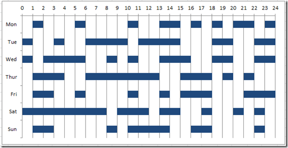
I think it does but Collette didn’t respond ![]() so we may never know.
so we may never know.
Anyway, lets see how to make this Weekly Time Schedule Gantt Chart in Excel.
The Breakdown
1) Create Chart Data Series with Time Worked and Fill Series
2) Create an Excel Stacked Bar Chart
3) Change Fill Series to FILL and Change the Time Worked Series to Same Fill Color
4) Format Both Axis
5) Chart Clean Up
Step-by-Step
1) Create Chart Data Series with Time Worked and Fill Series
This is the first tip/trick to create this Excel Gantt Chart for a Time Series. You need to create a chart data range that has a 1 for the time worked and a 0 when it is not worked. Then you also need to add an additional series for each hour to fill in the data for that hour if it was not worked. This is a formula that looks at the hour and if it equals 1 and was worked then put in a 0. If the hour was not worked and equals zero, then we need to fill in a 1 for the hour to make sure our data all lines up. For example, if hour one for Monday = 1, then the Fill series 1 for Monday should equal Zero. If hour one equals zero, then the fill series should equal 1. The formula might look like this: =if(b2=1,0,1). Here is what your sheet will look like: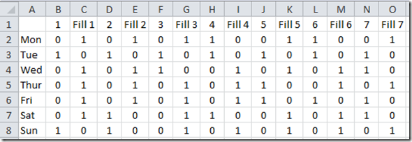
NOTE – That your chart and my chart didn’t end at hour 7, but went to hour 24, but it is hard to see on the web when you look at 48 columns of data.
The 1’s will be hour blocks of time and the zeros will not show up in our chart.
2) Create an Excel Stacked Bar Chart
Now that we have our data set up, we need to create our Excel Hourly Time Gantt Chart. Highlight your chart data range (from A1:AV8) and then go to your Insert Ribbon and choose the Stacked Bar Chart from the Chart group.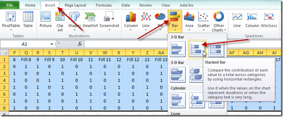
Your Excel Weekly Time Gantt Chart will look like this: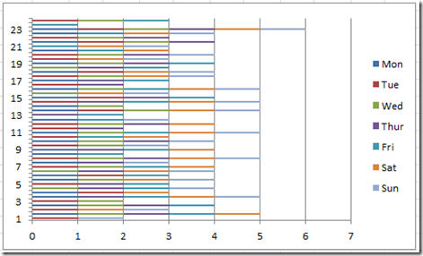
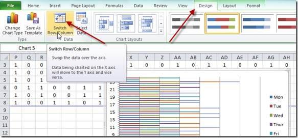
For the chart, you need to select the chart and then press the Switch Row/Column button on the Design Ribbon in order to get our format for this chart. If you want to learn why we have to do this and what Excel is doing, check out this post:
Why Does Excel Switch Rows/Columns in My Chart?
Your chart will then look like this: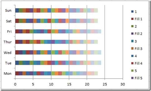
3) Change Fill Series to FILL and Change the Time Worked Series to Same Fill Color
Okay, we need to hide all the Fill series by changing the Fill Color option of each of those series to No Fill.
You can do this by selecting one of those data series in the chart, then right click on the series and select “Format Data Series…” from the pop-up menu.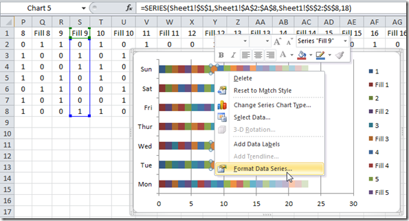
Then from the Format Data Series dialog box, choose the Fill Options and then choose the No Fill radio button: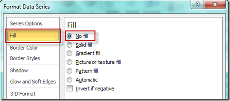
If you are having trouble selecting the Fill Data Series, you should check out this post:
How-to Select Data Series in an Excel Chart when they are Un-selectable?
Complete this step for every “FILL” Series. Then your chart should look like this: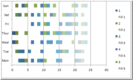
Okay, now we need to follow the same steps and change all the remaining Time Worked series to the same color. This way all the time will look like a block of time on each day. Lets change the Fill color of these series to a blue color. 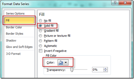
Your chart should now look like this: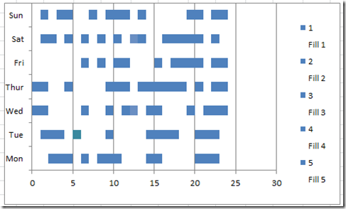
It is almost there. Just a few things left to do.
4) Format Both Axis
We should format both the Primary Horizontal Axis and the Primary Vertical Axis on the Excel Chart.
Right Click on the Primary Vertical Axis and choose “Format Axis…” from the pop-up menu.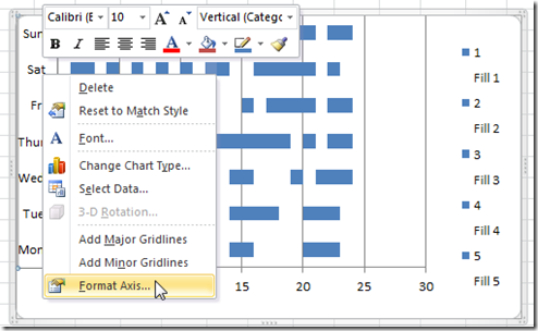
Then lets modify the vertical axis by selecting the “Categories in Reverse Order” check box: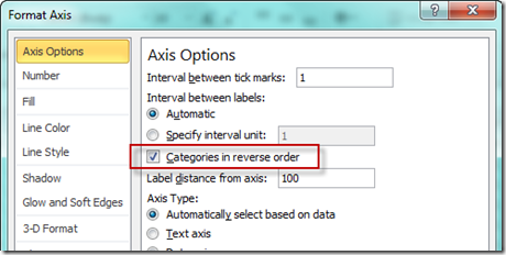
Your Excel Chart will now look like this: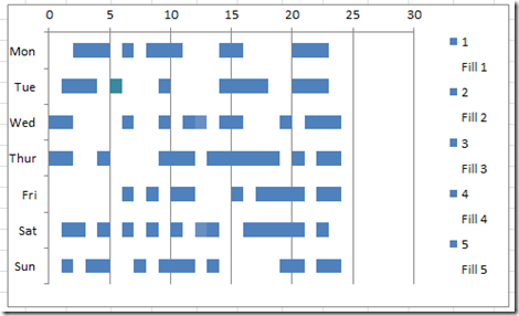
Now lets move on to the Horizontal Axis. Right Click on that and then select “Format Axis…” like we did with the Vertical Axis. Then lets change the Axis Options to: Minimum=0 Maximum=24 Major Unit=1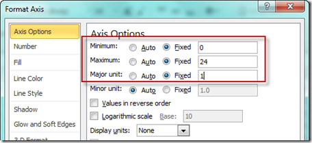
Your chart will now look like this. Almost there.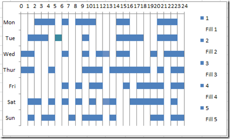
5) Chart Clean Up
Just two last things to do. Lets delete the legend. Simply select the Legend and press your delete key.
Then we need to fill out our chart area by selecting the chart area and drag/dropping it to the right.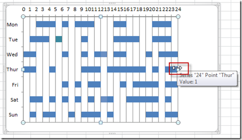
Your final chart should now look like this: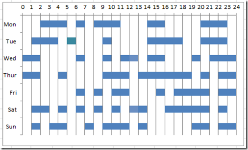
Video
You can watch a video tutorial of this Time Gantt Chart here:http://youtu.be/RP-cRxGKby4
Please let me know if this is helpful by posting a comment. Also, don’t forget to sign up for my RSS feed via Email so that you get the latest post delivered directly to your email inbox.
Steve=True

