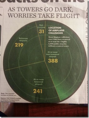
I have been traveling very frequently for business as a Salesforce.com Software Consultant, so I spend a lot of time in hotel’s and airports. So I get a lot of free newspapers like the USA Today at the hotel. In this case, I am travelling back and forth to a client site in Los Angeles and last Friday, I decided to see if I could replicate every chart/graph/infographic that I found in the Friday, April 5th 2013 edition of the USAToday using only Microsoft Excel 2007 (although, there is no reason that Excel 2003 won’t work for this as well but I can’t show you these steps in this tutorial). Also, I as my “Welcome / About Us” page states, I will not use any Excel macros or Excel VBA so that these charts and graphs can be used by any company dashboard or presentation and in corporation security model.
This is the first part of a multi-part posting so come back often to see how you too can make any of the charts and info graphics that you find in your daily newspaper like the USA Today using Excel.
Here are the first two charts of this series:
The infographic on the left depicts a baseball image with a pie chart super imposed on the top of the baseball image. The USA Today info graphic on the right is a similar type of graphic with a sweeping computerized radar graphic in the pie chart back ground.
Now these charts look simple, but it may not be as simple as you might think. Most people would create a pie chart…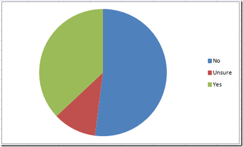 and then find a baseball image to insert into the spreadsheet…
then they would copy the baseball image and then select the pie chart and then paste the image, however, this is what your chart will look like: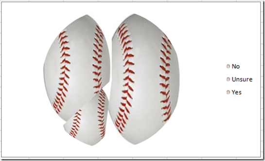
Notice that the image is now pasted into each of the pie chart data points and the baseball is squished into the graph. Not what we wanted above.
Alternately, you paste the image directly into the pie chart, but even if you can match up the baseball graphic with the pie chart, but I can’t find a way to get the image to move behind the chart, so this doesn’t seem to be a solution.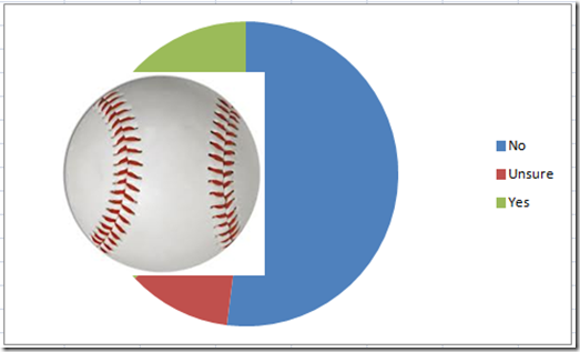
So how can we create the charts in Excel for the graphs you saw at the top of this posting? Check out below and let me know in the comments what you think.
The Breakdown
1) Find and Insert a Graphic into Your Spreadsheet
2) Setup Graph Data
3) Insert Chart / Create Chart
4) Copy and Paste Picture into Pie Chart Image Series
5) Move Pie Chart Image Series Down
6) Change Pie Chart Series Fill to Solid and Change Pie Chart Series Fill to 100% Transparent
7) Change Pie Chart Series Border Color to Solid
8) Change Pie Chart Series Border Style to 3Pt
9) Move Pie Chart Series to 2nd Axis
10) Delete Legend and Add Chart Title
Step-by-Step Tutorial
1) Find and Insert a Graphic into Your Spreadsheet
First things first, you need to find a graphic like a baseball or radar image. Download the image to your computer and/or insert/copy the image into your spreadsheet. Here are the 2 images I found:
2) Setup Graph Data
Now we need to set up our data. We need to create the data that will represent the pie chart and we also need to add one more series that will hold the baseball or radar image. Here is what the pie chart will look like for either chart: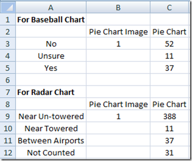
3) Insert Chart / Create Chart
Okay, now that we have set up our data, you will need create your pie chart in Excel. For the baseball chart, highlight the range from A2:C5 and for the radar graph, select the range of A8:C12. Then insert a pie chart from the Insert Ribbon: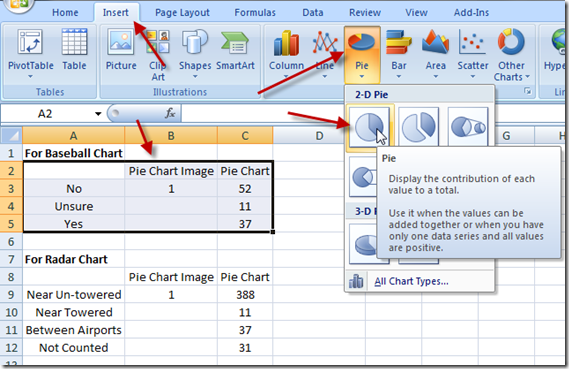
The process is the same for the radar chart of the baseball chart, but for the rest of this tutorial, I will focus on just the baseball pie chart. Your pie chart will now look like this: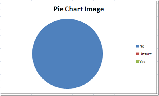
4) Copy and Paste Picture into Pie Chart Image Series
Now find the image that you inserted into your spreadsheet back on step 1 and press CTRL+C to copy it. Then select your chart and then select the blue pie chart you see above and press CTRL+V to paste the image into the chart. Your chart should now look like this: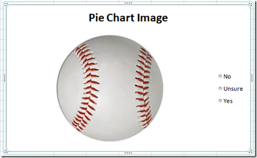
So we now have the image inserted into the data series that you saw in the Pie Chart Image series. Since that series only has one value, the baseball image will show up as one complete image.
5) Move Pie Chart Image Series Down
Now we need to move the baseball down in the chart Legend Entries (Series). You can do this by selecting the chart and right clicking on it. Then from the pop-up menu, you can choose the “Select Data…” option as you see here: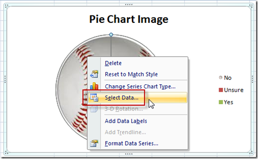
Then from the “Select Data Source” dialog box, you should select the Pie Chart Image and then press the down arrow button from the Legend Entries (Series) section: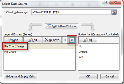
Your dialog box should now look like this: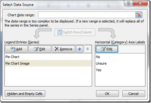
Your chart should now look like you expect to see for the Pie Chart data series: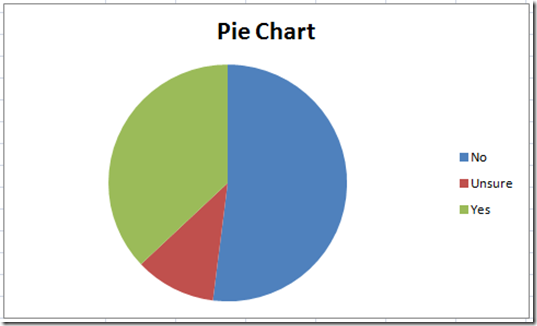
6) Change Pie Chart Series Fill to Solid and Change Pie Chart Series Fill to 100% Transparent
For this step, you don’t need to select any individual pie chart data point, just select the entire chart. Notice how there are selector points around all data points, not just one: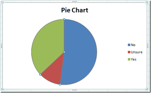
Then press CTRL+1 and you will see the “Format Data Series” dialog box. From there, select the Fill options on the left and then change your options to “Solid Fill” and also change the Transparency to 100% as you see below: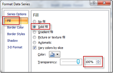
Your Excel pie graph will now look like this: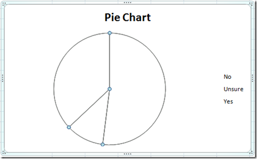
7) Change Pie Chart Series Border Color to Solid
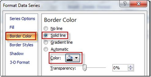
Now if you have left the “Format Data Series” dialog box, select the chart and press CTRL+1 to bring it up again. You don’t need to leave the dialog box to complete this step, but it was okay if you did. Now from the “Format Data Series” dialog box, select the Border Color options and then choose “Solid Line” and a color of “Black”
Your chart should now look like this: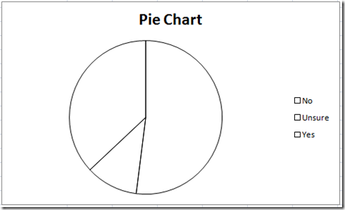
8) Change Pie Chart Series Border Style to 3Pt
Now if you have left the “Format Data Series” dialog box, select the chart and press CTRL+1 to bring it up again. This step is not necessary, but you may want to do this if your pie chart slices don’t stand out enough. Now from the “Format Data Series” dialog box, select the Border Styles options and then choose a larger “Width” of something like 2pt.
Your chart should now look like this: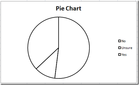
9) Move Pie Chart Series to 2nd Axis
Okay, here is where the MAGIC happens with this Excel Chart. Now if you have left the “Format Data Series” dialog box, select the chart and press CTRL+1 to bring it up again. Then from the “Series Options”, select “Secondary Axis” from the Plot Series on section.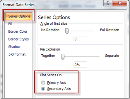
Now your chart should look like this: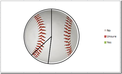
Looks almost like the real one from the USA Today.
10) Delete Legend and Add Chart Title
Now to make a few last changes, lets select the legend and press your delete key.
Then select the chart and from the Layout Ribbon, select Data Labels and Chart Title to give the Pie Chart more information for the reader. 
My final USA Today Infographic recreated in an Excel Pie Chart looks like this:
Here is the original.
Looks pretty good to me. What do you think? Let me know in the comments below.
Also, here is a real quick representation of the radar pie chart that I showed at the top: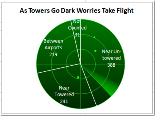
Video Demonstration
Here is a video tutorial how to make your very own Excel Pie Chart Infographic: http://youtu.be/y7wOcO6V11c
Please don’t forget to subscribe to my blog so that you get the latest posting delivered directly into your inbox as soon as it is ready.
Steve=True

