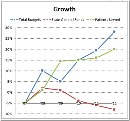
In the recent post: Friday Challenge – Mimic Newspaper Chart Line Style in Excel
we wondered if it was possible to recreate this Chart Line and Marker Style in Excel.
The main issue is that Excel doesn’t have an automatic line and marker style that represents this chart. Well, it is possible. Here is the solution:
The Breakdown:
1) Create Line with Markers Chart
2) Change Markers Options
3) Change Marker Border
Step-By-Step:
1) Create Line with Markers Chart
First we need to create our chart. To do this, highlight cells A1:D7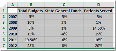
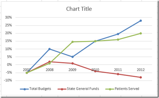
Then select the Insert Ribbon and then Line with Markers from the Line Chart button in the Chart group.
 Your chart should now look like this:
2) Change Markers Options
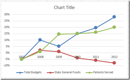
Just in case the chart you just created doesn’t have the correct markers, you need to change the marker options for each line. To do this, click on any one of your lines in the chart and then press CTRL+1 to bring up the Format Data Series dialog box. Then change the Marker Options to “Built-in” with a Type of a Circle and a size of 10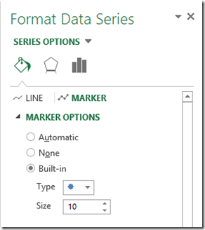 Repeat this step for each line. Your chart will now look like this:
3) Change Marker Border
Now we create the magic of how to create this new Chart Line Style in Excel. To create the line style, we need to create a large white border around the markers. To do this, select any line in your chart, and then press CTRL+1 to bring up the Format Data Series dialog box. Then change the Marker Border to Solid Line with a color of White and a Width of 2.5 points.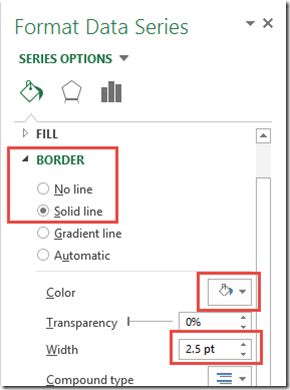 Repeat this step for each line. Your final chart should now look like this:
Make sure you look at the video to see how we create the custom horizontal axis and axis labels for the chart.
Video Tutorial:
Free Excel Chart File Download File:
https://www.exceldashboardtemplates.com/Excel-Line-Style-Challenge-Answer.xlsx
Steve=True

