Quantcast
Home Company and Industry P/E (Price to Earnings) Line Chart – 2 Ways Price-To-Earnings Comparison Line Chart using Excel Table Setup

Price-To-Earnings Comparison Line Chart using Excel Table Setup

Price to Earning Chart Graph for Excel

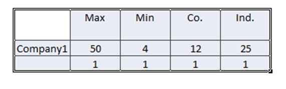
Data Table setup for Using an XY Chart to create a line graph in Microsoft Excel for a Price-to-Earnings Comparison for a company and an industry with minimum and maximum average P/E ratio.

Price-To-Earnings Comparison Line Chart using Excel Table Setup
Price-To-Earnings PE Comparison Using Excel Line Chart
Want to Receive the Next Post?
Join My Newsletter
Subscribe
Give it a try, you can unsubscribe anytime.
Privacy Policy
Close
Subscribe Now!   (Privacy Policy)
SUBSCRIBE

Stay Connected!

Get the latest post emailed straight to your inbox!
SUBSCRIBE
close-link