Project Managers and Executives love Gantt Charts. They also love Microsoft Excel, Charts and Graphs. So it is a natural to consider how you too can make a Gantt Chart in Excel.
Here is a sample of a Gantt Chart from Microsoft Project: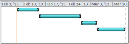
Here is a sample Excel Gantt Chart: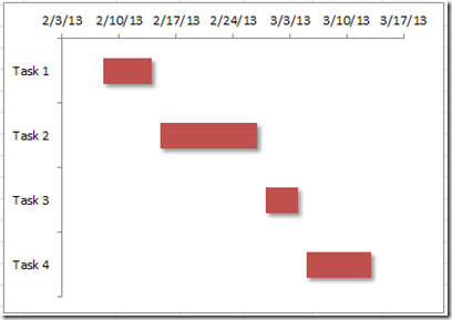
So how do we and how can you do this? Read this tutorial to find the 7 easy steps.
The Breakdown
1) Create the Project Plan Data
2) Create Gantt Chart Data Chart Range
3) Create a 2-D Stacked Bar Chart
4) Change Fill Series to No Fill
5) Change the Horizontal Axis Minimum, Major Unit and Number Format
6) Change the Vertical Axis to Category in Reverse Order
7) Chart Clean Up: Remove the Chart Legend and the Vertical Gridlines
Step-by-Step
1) Create the Project Plan Data
You will probably have data that looks like this and you want to create a Gantt Chart. But if you try and graph it now, it won’t give you what you want. So create some sample data like this to try it out: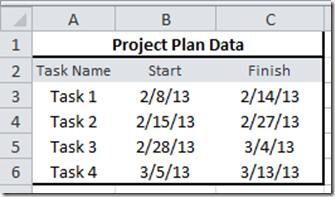
2) Create Gantt Chart Data Chart Range
In order to make a Gantt Chart, you need to create a different range that you will use for the Excel Gantt Chart.
I am creating a range outside of your project plan for the Excel chart so that it is easier to graph, but it is not necessary.
A) Create a column of data called “Task Name” and then copy the Task Name from your project plan data in the spreadsheet.
B) Create a column of data called “Fill” and then copy the Start Date from your project plan data in the spreadsheet.
C) Create a column of data called “Days” and then put in a formula that Subtracts your task Start Date from the Finish Date (in the graphic below the formula for cell G3 =C3-B3.
IMPORTANT: This is an important step when building your Gantt Chart Data Area. You need to highlight your Fill series and change the Number Format to General or Number.
Your final Gantt Chart Data area should look like this:
3) Create a 2-D Stacked Bar Chart
Highlight the Gantt Chart data range including the column headers from Cell E2:G6.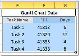
Then go to the Insert Ribbon and in the Chart Group, Select a 2-D Stacked Bar Chart from the Bar Button.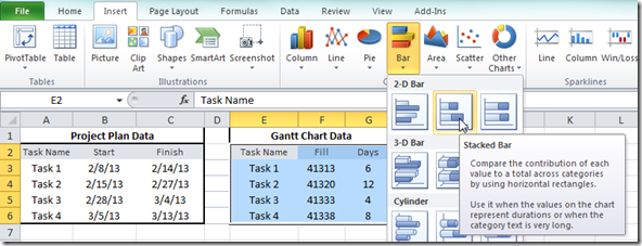
This is what you will now see in Excel: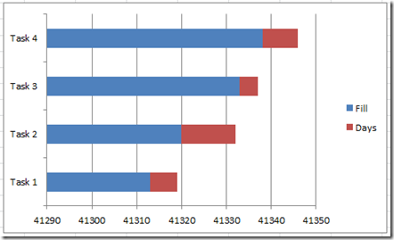
The next step is where your Excel Gantt will really take shape.
4) Change Fill Series to No Fill
This step makes it look very close to a Microsoft Project Gantt Chart. Right Click on the Fill data series in the Excel Chart and select “Format Data Series…” from the Pop-up Menu: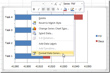
From the Format Data Series dialog box, you should select the Fill Options on the left and then choose “No Fill” on right.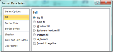
Your Excel Gantt Chart will now look like this: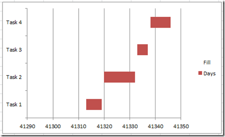
Almost done as it looks like a Gantt Chart, but we need to fix the Axis formatting in the next tutorial steps.
5) Change the Horizontal Axis Minimum, Major Unit and Number Format
A) Right click on the Horizontal Axis on the bottom and click on “Format Axis…”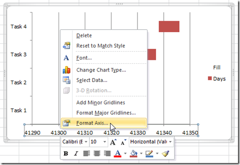
Then from the Axis Options on the left, change the Minimum to the same number as your earliest Project Plan Task Start Date in a number format that you see in the Fill series. Also, change the major unit equal to 7 so that it shows weekly dates.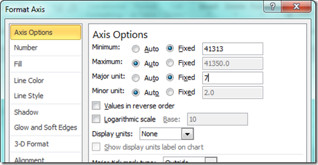
Now don’t leave the Format Axis dialog box as we can do the next part as well.
B) Select the Number options on the left, and then choose the Date Category on the right and select a short date format from the Type picklist.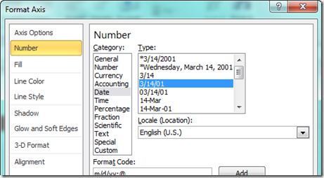
Your chart should now look like this: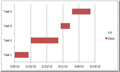
Looking like a real Gantt Chart. But not good enough for us. Lets do 2 real quick things:
6) Change the Vertical Axis to Category in Reverse Order
The MS Project Gantt Chart has the dates at the top of the chart, not the bottom. So how do we move the Horizontal Axis dates on top?
Right Click on the Vertical Axis that displays the Project Plan Task Names and choose “Format Axis…”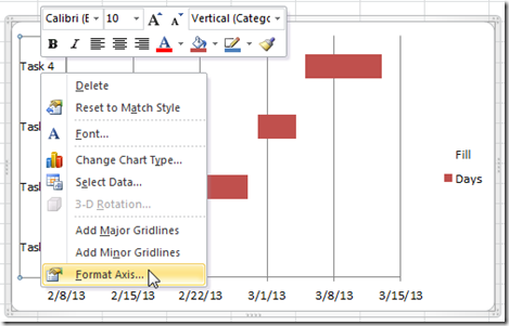
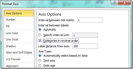
Then from the Format Axis dialog box, you should choose the Axis Options on the left and click the checkbox “Categories in reverse order”.
Your chart should not look like this: 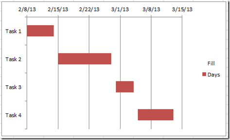
7) Chart Clean Up: Remove the Chart Legend and the Vertical Gridlines
We now just need to clean up a few things. Let’s start by deleting the legend. First select the legend and press the delete key.
You may also want to delete the vertical grid lines. This is an optional step that is really based on user preference. Select the grid lines and press your delete key.
Your final Gantt chart should look like this: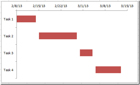
Video Tutorial
Watch how to make a basic Gantt chart with this quick video tutorial.
Please let me know if this will help you make your own Excel Gantt Chart. Also, don’t forget to sign up for my RSS Email feed so that you get the next Excel post delivered right to your inbox.
Steve=True

