Pipeline Usage Chart – Don’s Answer
Here is another response that I received from Don for our recent Friday Challenge:
Friday Pipeline Usage Challenge
Since we weren’t sure from the client if...
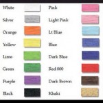
Match Product Chart Colors to Excel Spreadsheet Cells – Pete’s VBA Solution
In the recent Friday Challenge: Create Pipeline Usage Chart
A user wanted to create a bar chart where the values had a specific color by...
Friday Challenge – Pipeline Usage Chart
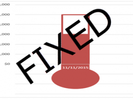
I recently got a request from a subscriber that asked if I could help them create a cylinder chart. However the sample that was...
Things You Cannot Do in Excel Online
Have you had a chance to use Excel Online Yet?
Well I have had a little time recently when I was working away from my...
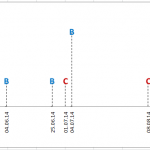
Friday Challenge Answers – Cumulative Events Over Time
In our recent Friday Challenge,
Friday Challenge – Creating an Excel Graph of Cumulative Events Over Time
where a user wanted the following:
Creating a graph of...
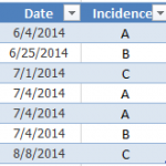
Friday Challenge – Creating an Excel Graph of Cumulative Events Over Time
Here is a Friday Challenge that a lot of Excel users may run into.
Essentially, you are given a date and incident type that occurred...
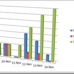
Terrible Chart Tuesday – Excel 3-D Clustered Column Chart
Welcome to another edition to Terrible Chart Tuesday. Here we see an example of what I think is a Terrible Chart that was create...
How-to Make a Dynamic Excel Pie Chart with 4 steps in less than 4...
This is an awesome guest post from our great friend Pete. He came up with this awesome technique to make a dynamic pie chart...
How-to Make an Excel Chart Go Up with Negative Values
In a follow-up to my recent Terrible Chart Tuesday, I wanted to show you 2 different techniques that you can use to create a...
How-to Mimic a Newspaper Chart Line Style in Excel
In the recent post: Friday Challenge – Mimic Newspaper Chart Line Style in Excel we wondered if it was possible to recreate this Chart...


