How-to Make a BETTER Excel Sales Pipeline or Sales Funnel Chart
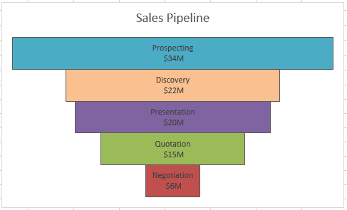
Learn how to make an accurate sales pipeline in Excel. In previous posts, I have showed you how to make a sales funnel chart...
How-to Create a Combo Line and Column Pivot Chart
Some Excel users can be confused when it comes to Pivot Tables and Pivot Charts. I recently saw a post asking for this help:
"Please...
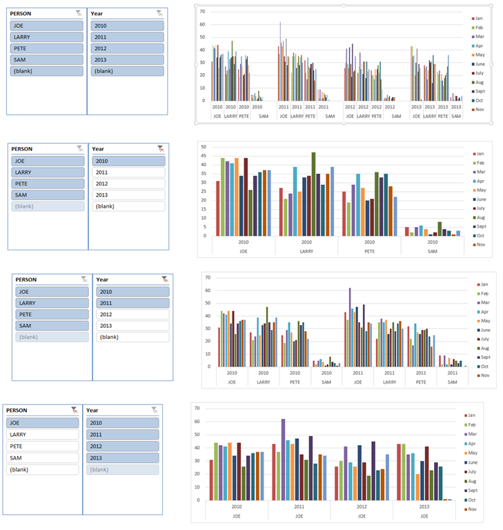
Friday Challenge Answer – Using Excel Slicers to Create Dynamic Charts
A big thanks to Don for submitting the first response to last week’s Friday Challenge.
You can check out the challenge here:
Friday Challenge – Excel...
New Feature Excel Flash Fill Use it for Quick Data Retrieval and Formatting
Excel Flash Fill
Every time a new version of Excel is released there are always new features that are hard to find and learn for those...
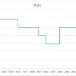
How-to Easily Create a Step Chart in Excel
You might be asking yourself, “What is a Step Chart?”
You have probably seen one, but didn’t know that it is called a step chart.
Here...
How-to Make a Cool Looking 3-D Sales Funnel or 3D Sales Pipeline Chart in...
Some times these types of charts are called funnel charts or some times they are called pipeline charts. Regardless of what you call them,...
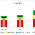
How-to Make an Excel Bullet Chart
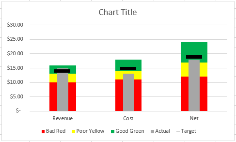
Executives and managers love to see gauge charts in their Excel Dashboards. However, gauge charts may confuse or mislead the dashboard readers. For instance,...
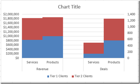
How-to Graph Three Sets of Data Criteria in an Excel Clustered Column Chart
Here is a very simple solution to a common Excel Charting question when a user wants to graph “Three sets of data criteria on...

