Quickest Way to Select and Align Charts for an Excel Dashboard
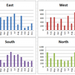
Select and Align Charts for an Excel Dashboard
Creating dashboards can take a lot of time. With this simple technique that I just learned, you...
New Take on the Excel Project Status Spectrum Chart
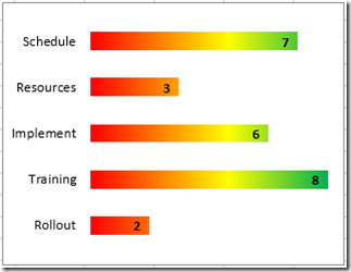
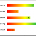
Leonid, a wonderful reader of our website, sent in a new take on my Excel Project Status Spectrum Chart. Here is what his looks...
Friday Challenge – Stumped on How to Display Data in an Excel Chart
I had some great responses to the last Friday Challenge, so I didn't want to stop the momentum with my answer to the last...
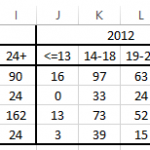
Friday Challenge – Data Transformation
This weekend starts the ModelOff competition.
"ModelOff is the world’s largest professional competition for Microsoft Excel, Financial Analysis, Investment Analysis and Financial Modelling." -Modeloff Site
If...
Friday Challenge – Pipeline Usage Chart
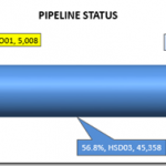
I recently got a request from a subscriber that asked if I could help them create a cylinder chart. However the sample that was...
Pipeline Usage Chart – Don’s Answer
Here is another response that I received from Don for our recent Friday Challenge:
Friday Pipeline Usage Challenge
Since we weren’t sure from the client if...
How-to Make a Music Festival Schedule Using Excel Conditional Formatting
Recently, I saw an Excel User posting a question about how to make this Music Festival Schedule using Excel Charts.
However, he originally created the...
SEO Performance Charts – Don’s Solutions
Sorry it has been a few days since my last post, but I have a lot that has been going on with new projects...
How-to Make an Excel Stacked Column Pivot Chart with a Secondary Axis
In this previous post:
Stopping Excel Pivot Chart Columns from Overlapping When Moving Data Series to the Second Axis
I had a fan question - How...
How-to Make a Pass Fail Chart in Excel
Last week, I posed a Friday Challenge that was posted in a Q&A for Excel. Here it is:
*****************************************************************
Plotting a line graph to track build...

