The Quickest Way to Select an Data Series in an Excel Chart
In a previous post, I showed you how to get around a frustration that many Excel users have when creating an Excel Dashboard chart. ...
How-to Add Centered Labels Above an Excel Clustered Stacked Column Chart
I am currently working on a project in L.A. and a business analyst at the client site was looking for a chart to present...
How-to Make a WSJ Excel Pie Chart with Labels Both Inside and Outside
I thought it was a in last week’s USA Today, but looking at the picture I took more closely, it may have been produced...
How-to Add Label Leader Lines to an Excel Pie Chart
This a an awesome technique to make your pie charts stand out in your Excel dashboard. However, I didn’t know about it for the...
Add Multiple Percentages Above Column Chart or Stacked Column Chart
I recently posted a tutorial on how you can put a percentage at the top of a Stacked Column Chart. You can see the...
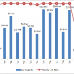
How-to Create an Excel Combined Chart for Tiger Woods Earning and Money Rank
Check out this Excel Combined Chart on how much money has Tiger Woods made over his career and also how did he rank in...
How-to Make and Add Custom Markers in Excel Dashboard Charts
When is a picture worth a thousand words? Definitely when you use custom markers in your Excel Charts.
This will make your Excel Dashboard Charts...
How-to Add Custom Labels that Dynamically Change in Excel Charts
Have you ever wanted to have a different data point label in your Excel Chart than what is offered by the Standard Excel Dialog...

