Weird Excel Charts
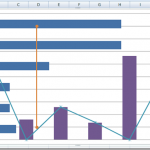
Have you ever seen a chart or graph like this in Excel?
I created this chart using Excel the other day.
It IS one combined chart...
How-to Make Dynamic Excel Dashboard Charts Using Tables
For almost every Excel Dashboard you will want to make a Chart template Dynamic. Meaning that as you add new data, the chart updates...
How-to Show Decades and Highlight a Year in the Horizontal Axis
Recently in an Excel Forum, a user had data similar to this format:
Here is what he wanted to do:
How do I set the Horizontal...
How-to Make an Excel Vertical Likert Line Chart with Categories
In the Mr. Excel forums there was a question raised on how can you create a Likert Chart or Graph using Excel. The person...
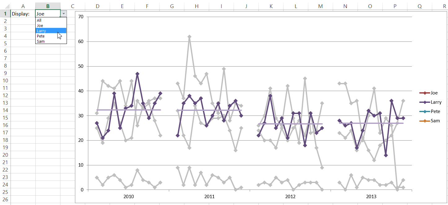
How-to Make an Excel PickList Chart for Multi Years by Month
Here is my response to the recent Friday Challenge on Creating a Chart for Multi Years by Month.
You can read more about the original...
How-to Show Gaps in a Line Chart When Using the Excel NA() Function
In last Friday’s challenge, we had a Excel Analyst that needed to remove outliers from his Excel Line Chart. In essence, he wanted to...
Create Dynamic Excel Chart Conditional Labels and Callouts
Chart Conditional Labels and Callouts
Learn how to make the simple and easy these Excel Chart Label Callouts:
In my most recent article, I described how...
How-to Make a Pass Fail Chart in Excel
Last week, I posed a Friday Challenge that was posted in a Q&A for Excel. Here it is:
*****************************************************************
Plotting a line graph to track build...
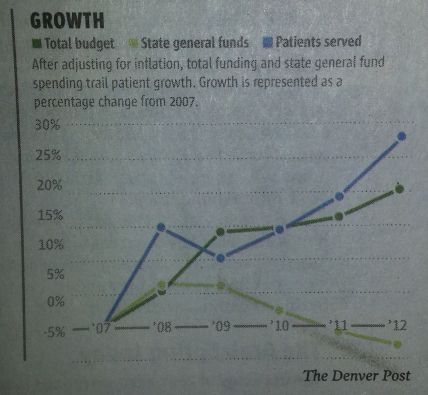
Friday Challenge – Mimic Newspaper Chart Line Style in Excel
Hi All,
Here is a fun challenge that I thought you might like. I saw this chart in the Denver Post and I wondered how...
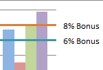
How-to Create Sales Quota Threshold Horizontal Lines in an Excel Column Chart
Sales executives are always pushing their sales teams. They typically do this by setting sales quota’s for their salespeople. Quotas are thresholds or minimum...

