Stopping Excel Pivot Chart Columns from Overlapping When Moving Data Series to the Second...
A fan of the blog asked a question about this post:
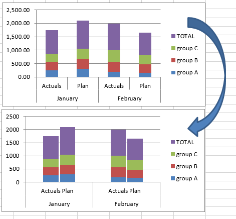
Stop Excel From Overlapping the Columns When Moving a Data Series to the Second...
How-to Make a Conditional Column Chart in Excel
As you build your Microsoft Excel dashboards, you may want to highlight your data points that exceed your Key Performance Indicators (KPIs) as well...
How-to Make an Excel Clustered Stacked Column Chart with Different Colors by Stack
In a popular post, I showed you how to easily create a Clustered Stacked Column chart in Excel using Multi-Level Category Axis options.
Here is...
How-to Show Decades and Highlight a Year in the Horizontal Axis
Recently in an Excel Forum, a user had data similar to this format:
Here is what he wanted to do:
How do I set the Horizontal...
How-to Graph Three Sets of Data Criteria in an Excel Clustered Column Chart
Here is a very simple solution to a common Excel Charting question when a user wants to graph “Three sets of data criteria on...
How-to Format Trend Line Color in Excel Dynamically
Many users use Trend Lines in Excel charts and graphs. They may also be used in Company Dashboards, but to you can make your...
How-to Make a Horizontal Tornado Chart Comparison
Recently in an Excel Forum, a user was asked to create a chart that compared 4 companies by month in a Column Chart.
HOWEVER, there...
How-to Make a Company Goal Chart or IPAD Battery Chart in Excel
I was looking at my IPod Touch and I really liked the battery graphic that is shown. Then I looked at my IPhone and...
Creating Excel Stacked Column Chart Label Leader Lines/Spines
In my last post, I showed you how to create a Brace/Curly Bracket/Mustache InfoGraphic type grouping in an Excel Stacked Column Chart.
You can check...
How-to Make an Excel Vertical Likert Line Chart with Categories
In the Mr. Excel forums there was a question raised on how can you create a Likert Chart or Graph using Excel. The person...

