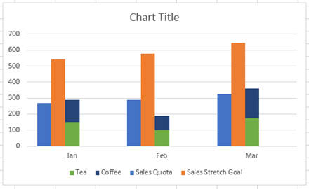
How-to Make an Excel Stacked Column Pivot Chart with a Secondary Axis
In this previous post:
Stopping Excel Pivot Chart Columns from Overlapping When Moving Data Series to the Second Axis
I had a fan question - How...
How-to Setup Your Excel Data for a Stacked Column Chart with a Secondary Axis
Many users have mixed reactions about this secondary axis overlap fix. You can see the post here:
Stop Excel From Overlapping the Columns When Moving...
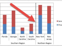
How-to Add Lines in an Excel Clustered Stacked Column Chart
I have posted several Excel chart samples related to Clustered Stacked Column Charts.
In case you missed them, you can check them out here: Excel...
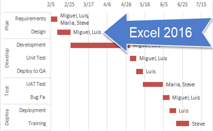
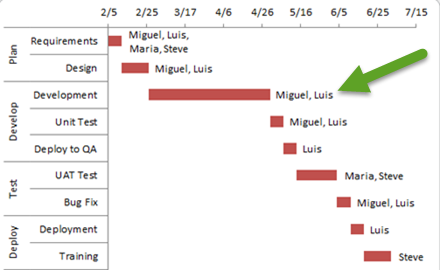
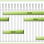
Create a Excel Gantt Chart to Display a Music Festival Band Schedule
Here is Pete's answer to the recent Music Festival Schedule Challenge.
In this video, see how he used Index/Match functions as well as a helper...
Don’s Macro Enabled Friday Challenge Answer – Music Festival Schedule Excel Chart
In our last Friday Challenge, we wanted to see if you can make a Music Festival Schedule in an Excel Chart.
There were 2 questions. ...
Friday Challenge – Create a Chart to Display a Music Festival Schedule
Here is an interesting question that I saw and I thought I would present it as the next in the series of Friday Challenges.
This...
How-to Graph Three Sets of Data Criteria in an Excel Clustered Column Chart
Here is a very simple solution to a common Excel Charting question when a user wants to graph “Three sets of data criteria on...
Pipeline Usage Chart – Don’s Answer
Here is another response that I received from Don for our recent Friday Challenge:
Friday Pipeline Usage Challenge
Since we weren’t sure from the client if...
How-to Make a USA Today InfoGraphic Chart In Excel
In a recent issue of USA Today, the following infographic was posted on the U.S. women’s national soccer team player appearances.
I liked it...
How-to Make an Excel Bullet Chart
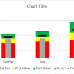
Executives and managers love to see gauge charts in their Excel Dashboards. However, gauge charts may confuse or mislead the dashboard readers. For instance,...

