Don’s Take on the Better Sales Funnel Chart
I got a positive comment from Don and he liked the Better Excel Sales Pipeline / Sales Funnel Chart.
But....he thought it lacked ***flash***!
So he...
How-to Make a BETTER Excel Sales Pipeline or Sales Funnel Chart
Learn how to make an accurate sales pipeline in Excel. In previous posts, I have showed you how to make a sales funnel chart...
How-to Make an Excel Project Status Spectrum Chart
Here is the long awaited demonstration of a recent Friday Challenge.
The challenge was to recreate a Project Management Status Chart that I saw on...
Friday Challenge – Recreate an Excel Project Status Spectrum Chart
I am always looking for charts or anything that I can put into an Excel chart. In fact, I just skim the Wall Street...
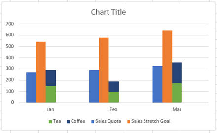
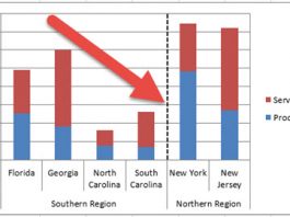
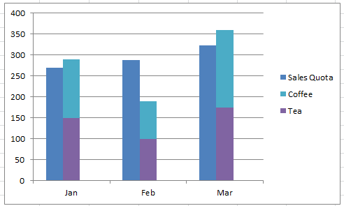
How-to Close the Gaps Between Chart Series in an Excel Stacked Clustered Column Chart
Many users like to create a chart that Excel doesn’t have as a chart type. It is a combination of a clustered column and...
Stop Excel From Overlapping the Columns When Moving a Data Series to the Second...
Don’t worry, Excel is not changing your chart to a Stacked Clustered Column Chart or Stacked Bar Chart when you move a data series...
Friday Challenge – Create a Percentage (%) and Value Label within 100% Stacked Chart?
First I want to say I am sorry to those waiting to see the dynamic chart scroll bar tutorial. My project launched this week...
Multi-Column Stacked Chart – How would you do it? – How I did it.
First, I want to say thank you, because you are an Excel fan. Then again, maybe you are an Excel Geek? I know I...
How-to Make a Tenant Timeline Excel Dashboard Chart
So last week, I posted this question that I responded to in an Excel forum. I also asked you how you would solve this...
Tenant Timeline – How would you create an Excel chart for this data?
A user wanted to know how to create an Excel chart that shows when his tenant’s leases are expiring. He wanted to put this...

