Do you want your Excel charts and dashboards to really stand out at your company?
Well then you should start using custom colors in all your graphs.
It is really simple, but some people do not know how to apply the custom colors.
1) Create Your Chart

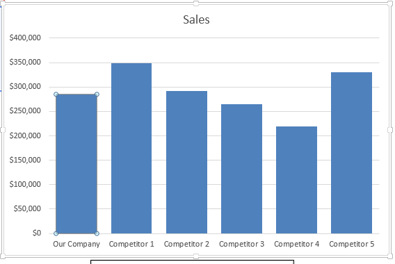
2) Select Your Chart Data Point by selecting the chart, selecting the series and selecting the data point
3) Press CTRL+1 to Bring up the Format Data Point dialog box
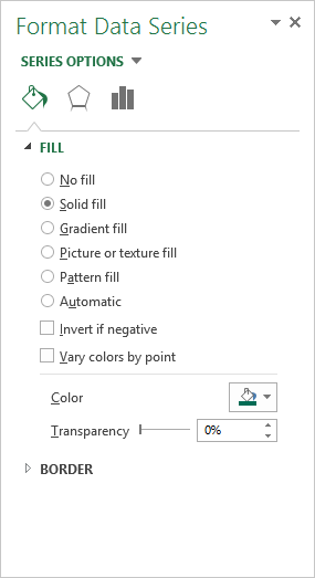
4) Select the Fill Options of Solid Fill and then select Color and then select Custom Color
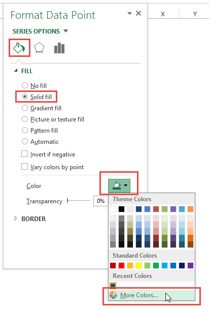
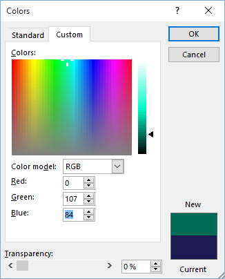
5) From the Color Dialog Box, select the Custom tab and then type in your Red, Green and Blue colors that you got from your marketing department.
Note: If you don’t have an RGB color, you can user HSL or search on google to convert HEX to RBG or any other color format. They are easy to find and use.
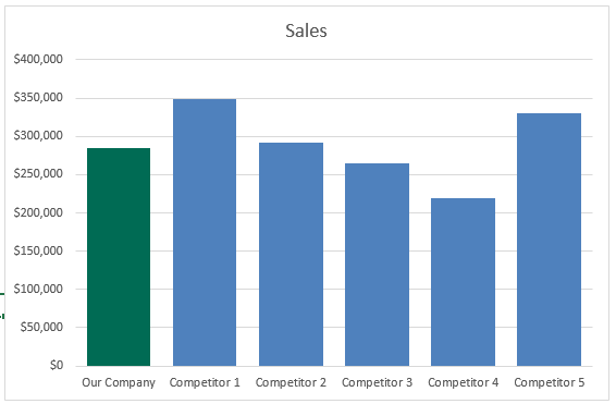
Your final chart will now have your company’s custom color. It really stands out in any chart. Give it a try!
Here is a quick Video Tutorial on this topic:
My company uses RGB and others have used HEX. Does anyone use HSL? Let me know in the comments below.
Steve=True
Follow-up Video:


