Create a Stacked Clustered Column Chart in Excel
There is one type of chart that is always requested, however, Excel doesn’t offer this type of chart. What could it be?
Excel does not offer a Clustered Stacked Column chart, nor does it offer a Clustered Stacked Bar chart. Excel offers a Clustered Column chart type and a Stacked Column chart type, but it doesn’t offer the combination of these two charts. Same goes for a Clustered Stacked Bar chart.
What does Clustered Stacked Column Chart show?
Well a clustered stacked column chart would allow you to group your data (or cluster the data points) but use it in conjunction with a stacked column chart type.
Here is what a Clustered Stacked Column Chart would look like: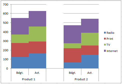
Here is what a Clustered Stacked Bar Chart would look like:
Why doesn’t Microsoft Excel offer these types of charts? I don’t know, but they are commonly requested by users. I this tutorial, I will show you how to make a Clustered Stacked Column Chart, but the technique is the same when creating a Clustered Stacked Bar Chart. The only difference is that you will choose a stacked bar chart instead of a stacked column chart. Other than that, everything else is exactly the same.
The Breakdown
1) Create a Chart Data Range
2) Create Stacked Column Chart or Stacked Bar Chart
. (Note: this tutorial will show only the Stacked Column Chart Type but the techniques are the same)
3) Switch Row/Column
4) Change Column Gap Width
5) Change Vertical Axis
6) Change White Fill Series to a Color of White
7) Remove the White Fill Label from the Legend
Step-by-Step
1) Create a Chart Data Range
This is the critical step in making an EASY Stacked Clustered Column Chart. There are other ways to create this Excel chart type, but they are not easy and usually confuse people.
What my solution involves is using Multi-level Category Labels as your Horizontal Axis format. 
Multi-level categories is the key. You can check out other examples of charts that I have created with Multi-level Category Labels here:
Case Study Solution – Mom Needing Help on Science Fair Graphs/Charts
This chart is going to compare the advertising spend on two different products in four categories for both budgeted numbers and actual numbers.
So here is how we want to set up our data:
As you can see, I have 2 products. Then I have a separate line for the budgeted advertising dollars and the actual advertising spent. There are 4 categories of the budget and expenditures related to Radio, Print, Television and Internet. You will also see a chart data series on the right called White Fill. This is used to create a blank between the clusters. You can check out a post with a similar trick here:
How-to Make a Wall Street Journal Horizontal Panel Chart in Excel
I am going to spend the bulk of this post here, so lets examine the way that I have set up the data.
The first row of the data contains the items that we want to appear in the legend as the categories of our stacked columns.
The next few rows represent our the first section of our first Stacked Clustered data group. This will be for Product 1 and we have 2 rows, 1 that represents the budgeted advertising dollars and one that represents the actual advertising dollars for all 4 categories (radio, print, TV and internet.
The biggest thing to remember here is that we have created a Multi-level Category. We have done this in Column A. Notice that A3 has the Product name, but there is nothing in A4. What this does is create a grouping or Multi-level Category for the chart for the first product. Here is what it will look like in the final chart:
Notice how it creates a grouping for Product 1 and has subcategories for the budget vs actual numbers.
The next row appears to be a blank row. It is mostly blank except in 2 cells. In cell G5, I have put the value of the highest horizontal gridline that I want to display in the graph. 
Also, in cell A5, I have put in a Space. Just a simple space with your keyboard. I put a space in cell A5 so that the Multi-level Categories in Excel will put a line from the chart to the bottom of the horizontal axis labels.
Here it is with a space and without a space


See how the grouping for Product 1 is tight around the budget and actuals vs on the right when it spans across the empty space? The space is important to tell Excel where the first Multi-level Category ends.
Finally, the last area of the chart data range is our next advertising expenditures grouping for Product 2.
2) Create Stacked Column Chart or Stacked Bar Chart
Now that you have set up your data, you can create your chart. Highlight the range from A2:G7 and then choose the Stacked Column chart from the Column button on the Insert ribbon.
Your chart should now look like this:

3) Switch Row/Column
Now our chart isn’t in the right format that we want. We wanted the Product and Budget vs Actual labels on the horizontal axis, not the advertising groups. We can can fix this by selecting the chart and then choose the Switch Row/Column button from the Design ribbon.
If you don’t know why Excel is doing this, please check this post:
Why Does Excel Switch Rows/Columns in My Chart?
After you have done this, your chart should now look like this:
4) Change Column Gap Width
This is looking very close to what we want. Now lets make the groupings appear more closely related. We can do this by changing the Gap Width from the Format Series Dialog Box. You can get to these options by right clicking on any data series in the chart and then selecting “Format Data Series” from the pop up menu.
Then change the Gap Width from the Series Options to your desired size. In this case, I am going to change the gap width to 25%.  This will make the clustered stacked columns move closer together so that the data can be compared more easily. Here is what your chart should look like now:
5) Change Vertical Axis
I don’t like the default vertical axis maximum that Excel sets for us. I would like to change it to something that is closer to my data. Right click on the vertical axis and then choose “Format Axis” from the pop up menu.
Then from the Format Axis dialog box in the Axis Options, change the Minimum to 0 and the Maximum to 701 as you see here:
Your resulting chart should now look like this:
6) Change White Fill Series to a Color of White
We are almost done. Now we added an additional series called White Fill that will create even more separation between the 2 different clustered stacked column chart. So to make it do this, we need to right click on the White Fill column and choose the “Format Data Series…” from the pop up menu.
Then, from the Format Data Series dialog box, go to the Fill options and then change the Fill choice to Solid Fill and change the Fill Color to White. 
Your chart should now look like this:
7) Remove the White Fill Label from the Legend
Looks great. We are almost done. Only one last thing to do. We need to remove the “White Fill” legend entry. We can do this pretty quick and easily by first selecting the chart, then select the legend and then finally selecting the “White Fill” legend entry. Now it should look like this:
Once you have the “White Fill” legend entry selected, simply press the delete key. Your final chart will now look like this:
This is how you can create a very simple and easy Clustered Stacked Column Chart. Check the link below to see this tutorial in action in a video demonstration.
Free Excel Chart Template File Download
How-to-easily-create-a-stacked-clustered-column-chart-in-excel.xlsx
Video Demonstration
If you like this posting, please share it with your colleagues so that they can learn more about Excel too.
Steve=True


Reader discussion
Comments preserved from the original page. New comments are closed.
Reader
June 6, 2013 At 6:03 am
Hi
I have followed these instructions and all works well except for the multi-level categories. When I format the axis there is no option for multilevel categories; it has disappeared. I am using Excel 2010. Please help. Thanks
Andrew
Reader
June 11, 2013 At 1:56 pm
Hi AndrewT,
Thanks for visiting my site. It sounds like your chart is not a column or bar chart. perhaps it is a xy scatter chart? If so, then you would not have the choice for a multi level category as this is not on an XY scatter chart. Please let me know if this helps.
Steve=True
Reader
February 21, 2014 At 5:27 pm
Hi – I am having the exact same issue as Andrew had. I definitely have a stacked column chart but I don’t see the multi-level category chackbox. Any ideas? Any help would be very much appreciated.
Reader
July 16, 2015 At 4:56 pm
Hi Mark, sorry for the late reply. I think the issue is not Excel 2010, but the data.
Check out this post:
https://www.exceldashboardtemplates.com/fixing-your-excel-chart-when-the-multi-level-category-label-option-is-missing/
Steve=True
Reader
March 2, 2015 At 4:09 pm
Is there a download link for this file?
Reader
March 2, 2015 At 4:50 pm
Hi Michael, thanks for the comment and suggestion. I have updated the post and it now contains the free sample download file. Thanks again. Steve=True
Reader
November 19, 2013 At 3:06 am
Hi AndrewT,
Did you ever get a response on this or work out how to do this with excel 2010?
Reader
July 16, 2015 At 4:56 pm
Hi AndyP, sorry for the late reply. I think the issue is not Excel 2010, but the data.
Check out this post:
https://www.exceldashboardtemplates.com/fixing-your-excel-chart-when-the-multi-level-category-label-option-is-missing/
Steve=True
Reader
September 7, 2014 At 8:04 pm
I’m using office 2013 it seems I don’t even need to set multi-level categories.
Reader
September 7, 2014 At 8:45 pm
ah, sorry. See the youtube link now.
Reader
July 16, 2015 At 4:57 pm
Hi AndrewT, sorry for the late reply. I think the issue is not Excel 2010, but the data.
Check out this post:
https://www.exceldashboardtemplates.com/fixing-your-excel-chart-when-the-multi-level-category-label-option-is-missing/
Steve=True
Reader
July 17, 2013 At 8:11 am
Hi, the video was very helpful. I’m using Excel 2011 on Mac and I can’t figure out how to switch the rows and columns. When I use the transpose button it does not change the axes appropriately.
thank you for your help!
Julie
Reader
July 17, 2013 At 5:11 pm
Thanks so much for the nice comment. Sorry, I don’t have a MAC. Maybe one of my readers can post a reply.
Reader
September 7, 2014 At 8:18 pm
Thanks for providing this guide. Video? I did not see it. But the text is already enough.
Reader
July 17, 2013 At 8:59 am
Oh I actually figured it out! In case anyone else is curious: Chart ribbon > data > select > switch/row column
thanks!
Reader
July 17, 2013 At 5:10 pm
I am so glad you figured it out. Sorry, I don’t own a MAC 🙁
Reader
July 25, 2013 At 2:50 pm
Hey!
Great stuff!
How can I make this kind of charts in Excel 2003? I’ve looking for this in several websites but so far I haven’t had luck.
Thanks!
Reader
July 25, 2013 At 11:26 pm
Hi Omar,
You should be able to create this same chart in Excel 2003, but the steps may be slightly different in order of operation. However, I am pretty sure that multi-level categories for the horizontal axis are available in Excel 2003. I don’t have a current version of that platform, but may get one soon to show you how. Let me know if you figure it out first. Steve=True
Reader
March 9, 2014 At 2:07 pm
Hi Steve,
I just watched this subject video on Youtube and it helped me out tremendously! Thank you do much! I just had one question – is there a way to make the bottom axis label, in your example the one that says “Product 1”, appear at an angle, without having the other part of the label be angled? If not I wouldn’t mind if both were angled but when I try to go in and set it at an angle it only angles the upper part (in your example the “Bdgt” and “Act”. I can’t get the label below it to change. Any assistance you can give would be greatly appreciated!
Many thanks, CJ
Reader
June 24, 2014 At 4:09 pm
Hi CJ
Sorry. I dont think you can angle both with in the chart. Steve=true
Reader
March 19, 2014 At 11:07 am
Hi, thanks for posting the video on Youtube! This method really helped me out with a project.
One problem though: I created the chart in Excel 2013 and sent it to a coworker who has Excel 2007 and the chart didn’t display properly – the bars were crunched and it appears that the X axis switched to the Y axis. I tried clicking the Switch Row/Column option, but it isn’t clickable. I also tried sending it in 97-03, but had the same result.
Reader
March 19, 2014 At 1:37 pm
I think I figured out the problem: I was sending charts without the data in the Excel doc.
Reader
April 23, 2014 At 5:27 pm
Great tutorial, makes me look like an excel all-star when using these charts. Once question though around formatting. My top level category’s (product 1 and 2 in your example) text is all overlapping, or so small it’s unreadable. Is there anyway to increase the size of the axis text box so that I can increase the size of the text without it overlapping? (similar to making the key box larger to accommodate larger text keys?) Thanks
Reader
April 28, 2014 At 9:13 am
Thanks Ryne, what a great comment. The only way I know to fix this is increase the overall size of your chart or decrease the size of your font. Steve=True
Reader
April 30, 2014 At 1:51 pm
Ryne you need to make your chart bigger or your text a smaller font. Steve
Reader
January 7, 2016 At 8:04 am
Make it so the alignment is vertical rather than horizontal 🙂
Reader
January 18, 2016 At 5:02 pm
Hi Adam,
This technique will also work for Bar charts, is that what you mean?
Steve=True
Reader
May 30, 2014 At 1:19 pm
I have an interest in creating matrix using excel 2007. I could you someone point me to a site with user friend examples.
Reader
May 30, 2014 At 1:23 pm
Hi Namedj. I am not sure I understand your question. Can you please describe the matrix? What do you mean by matrix? Thanks Steve=True
Reader
June 24, 2014 At 11:38 am
Very useful post. Thanks for sharing it.
On suggestion if you are using Excel 2013 (not sure if earlier versions has this option), for the WhiteSpace column, you can select ‘no fill’ as an option and then you will not hide the chart lines.
Reader
June 24, 2014 At 4:03 pm
Thanks for your comment Gimli. Actually I was using the white series to hide the guidelines. So you point is valid but then I would just omit the series (column) altogether as it would not be needed. Tgan Liu s again for the nice comment. Steve=True
Reader
July 4, 2014 At 9:40 am
This is great. I must have missed a step, though, because the vertical access in my chart is repeating values i.e. 1, 1, 2, 2, 3, 3 instead of just 1, 2, 3. Any insight? Thanks
Reader
July 16, 2015 At 4:53 pm
Sorry for the late reply bubba, I assume you have a strange number format. Hopefully you figured it out. Thanks
Reader
August 27, 2014 At 1:13 pm
I had posted my question in another tutorial, but it’s better here. Sorry about the repost!
Question framed using the example above: could I put Bdgt. on the primary axis and Act. on the secondary axis?
My issue: I have clustered two stacked columns for each month in the year – one column is dollar value of purchases and the other is the number of purchases. Stacking captures the purchase type (service vs product). The each purchase is very high dollar value while there aren’t that many total purchases in a given month so the dollar value bar is much bigger than the number bar. In fact the number bar barely shows up on the chart. Is there anyway to put dollar value on the primary axis and number of purchases on the secondary axis so the info can be displayed better?
Reader
September 11, 2014 At 3:20 pm
Hi EC,
You inspired me to create a new tutorial. Essentially you need to change the data setup and it will work. Check out the step-by-step and video here: https://www.exceldashboardtemplates.com/how-to-create-a-stacked-clustered-column-chart-with-2-axes/ Hope this helped. Steve=True
Reader
October 9, 2014 At 1:38 pm
Thank you for the well done video – easy to understand and implement. I am framing my question using the above example:
I would like to make the same chart but with different categories for each product. I would like to have the categories ‘internet’, ‘tv’, ‘print’, ‘radio’ for product one but ‘books’, ‘tape’, for product two – I actually have three products but the point is the same. Can you provide any guidance?
Reader
July 16, 2015 At 4:54 pm
Hi AMA, sorry for the late reply. I am sure you figured it out by now, but the concept is the same. Good luck
Reader
November 18, 2014 At 1:49 pm
thanks! this helped 🙂
Reader
November 18, 2014 At 3:06 pm
Glad it helped Taz. Thanks for the comment. Steve=True
Reader
April 23, 2015 At 2:24 pm
This is great Steve. Thank you very much! I have built my chart just the way I imagine it thanks to you.
Reader
April 24, 2015 At 8:15 am
Abimael, I am so happy to help you. Thanks for the great comment. Steve=True
Reader
June 23, 2015 At 8:20 am
Thank you very much for the help. I am not one for tutorials but I was able to follow your instructions and now have the results I was looking for. Thanks again…
Reader
July 16, 2015 At 9:23 am
Ted that is a great comment. So glad to help. Thanks for being a fan. Steve=True
Reader
July 1, 2015 At 4:58 am
Hi Steve
I followed your u tube video and it worked out perfectly. What I am wondering is can you add a percentage data label? I can do the standard one but when I go to select the percentage range it doesn’t work, I also tried selecting just the cells that I want to match the data and that doesn’t work?
Any ideas?
Thanks
Nicola
Reader
July 16, 2015 At 4:51 pm
Hi Nicola,
I am not sure where you are trying to add the percentage.
Does this tutorial help?
https://www.exceldashboardtemplates.com/how-to-add-centered-labels-above-an-excel-clustered-stacked-column-chart/
or this one?
https://www.exceldashboardtemplates.com/friday-challenge-answer-create-a-percentage-and-value-label-within-100-stacked-chart/
Hope these help.
Steve=True
Reader
July 10, 2015 At 5:37 am
Thanks a lot for this great tutorial! I am processing WHO/UNICEF data for a report and was wondering how they come up with their graphs.
Now I know!
Reader
July 16, 2015 At 9:19 am
Thanks Samantha. So glad to help! Steve=True
Reader
March 31, 2016 At 9:45 am
Steve, thank you so much! I have been photoshopping my charts to get the result I needed, now it will save me tons of time in the future and for my current task!
Reader
March 31, 2016 At 10:05 am
Awesome, so glad to help. Thanks for the great comment.
Reader
May 20, 2016 At 7:07 am
I have noticed that if I have a lot of data in the table that the graph does not come out correctly, but if I select the first few columns as the data, create the graph, click on the graph and then use the blue lines that form a box around the selected data, I am able to drag the blue line to the right, selecting all the data, and the graph is correct. Hope this helps someone. Took me a little thinking time to discover this work around.
Reader
August 8, 2016 At 11:27 am
Amazing tutorial! The clear instructions followed by pictures of each step made it so easy for me to create the graph for work. Thank you so much!!
Reader
August 9, 2016 At 11:14 am
You are welcome Laura, thanks for the nice comment.
Reader
August 16, 2016 At 2:30 pm
Thanks for the tutorial. what if I don’t have my data in this format. I have my budget an actuals horizontally across categories, not vertically. Can I use data in this format to create this chart. Thanks.
Reader
August 16, 2016 At 2:42 pm
It should work. You just will may have to Switch your Rows/Columns. Good luck and you are welcome. Thanks for the great comment.
Reader
September 20, 2016 At 10:17 am
I was able to make my chart as per our instructions, but I have just one question regarding removing the fill from the white fill bar. It also removes the grid lines in the background. Is there a way to get the grid lines back into the chart once the bar is removed?
Reader
September 28, 2016 At 5:28 pm
Hi Marci, just click on the chart, then layout, then gridlines then Horizontal gridlines. They should return. Strange that removing a data series would remove the gridlines. Never seen that before.
Reader
March 8, 2017 At 4:58 am
Excellent work around – very useful.
Thanks
Reader
April 16, 2017 At 4:52 pm
You are welcome
Reader
March 15, 2017 At 4:31 am
That’s just great, I am able to create chart with this tutorial. The Microsoft Excel is very vast and very difficult to master. Thanks for sharing such tutorial.
Reader
May 2, 2017 At 4:45 pm
Thanks Morris. I appreciate you nice comment.
Reader
April 12, 2017 At 2:50 pm
I just wanted to say that this helped so much! Undoubtedly the best tutorial I found on the internet 🙂
Reader
April 16, 2017 At 4:51 pm
Thanks Margret!
Reader
May 23, 2017 At 6:26 pm
Thanks for your help!
Reader
May 25, 2017 At 8:47 am
You are welcome Ben, thanks for the nice comment!
Reader
May 31, 2017 At 10:13 am
Thanks! Helpful!
Reader
June 1, 2017 At 7:59 am
Thanks Durin for the nice comment 🙂
Reader
June 22, 2017 At 3:18 pm
Perfect! Wish I’d found this before I spent all morning trying to figure it out myself! It worked perfectly on my Mac. Thanks!
Reader
June 26, 2017 At 8:16 am
Thanks for the great comment! Glad it worked for MAC too!
Reader
June 23, 2017 At 5:39 am
This is really great and works perfectly – I just had to reshuffle my data so it was laid out exactly as you had it. Thanks for a really great tutorial 🙂 super useful.
Reader
June 26, 2017 At 8:18 am
Awesome, so glad to help and thanks for the great comment!
Reader
June 27, 2017 At 7:20 am
Thank you Steve! Creating a chart like this puzzled me until I found your helpful instructions. You saved my project!
Reader
June 27, 2017 At 7:33 am
Awesome, so glad to help!
Reader
July 11, 2017 At 9:57 pm
Thank you for sharing this skill.
A little tip that set transparency to 100% seems better than fill white color to the “White Fill” series.
Reader
July 12, 2017 At 9:52 am
Thanks Peter. The white fill series is technically unnecessary. It was just the way I liked to put in additional separation. Thanks for the comment.
Reader
September 5, 2017 At 12:39 am
Steve Equals True, love the name and the article thanks.
Reader
September 6, 2017 At 5:55 pm
Thanks so much! I appreciate your kind comments.
Reader
November 28, 2017 At 10:45 am
Hi Steve,
Do you have a way to create an [actual vs demand] chart of departmental (internal) against total (internal & external) calls plus responded & received emails as overlapped monthly columns?
Thank you in advance.
Regards,
Dennis
Reader
November 30, 2017 At 9:44 am
Hi Dennis,
Are you thinking about a chart like this tutorial?
https://www.exceldashboardtemplates.com/create-stacked-unstacked-column-chart-excel/
Reader
May 18, 2018 At 9:33 am
You are awesome, Thanks for this tutorial, template, and great explanation. It’s amazing!
Reader
May 21, 2018 At 10:07 am
Thanks for the great compliment and comment!!
Reader
June 7, 2018 At 9:36 am
Thanks, very useful! A slight improvement would be to replace the number in the “white fill” column (701) with “=na()” to eliminate the gap in the unit guide lines.
Reader
June 8, 2018 At 9:56 am
Thanks Nathan, the white fill column was to actually create a gap and hide the lines 🙂 personal preference really. You can remove the column, data and steps entirely as you see fit. Thanks for thinking it is useful.