Have you ever created a lot of charts in an Excel Worksheet and drove yourself crazy trying to line the charts up?

Notice how the charts above are all not in perfect alignment? Well, here is a quick tip on how to align your Excel charts.
Excel (as well as most the Microsoft products) has a wonderful Align feature that you can use on Shapes, Text Boxes and Charts. You may not believe it, but many Excel users do not know that this feature exists, so lets see how to do it.
To align your charts in a straight fashion, you will want to do the following:
1) Select one chart
2) Hold the Shift key down or Hold the CTRL key down.
3) Select the second chart to align
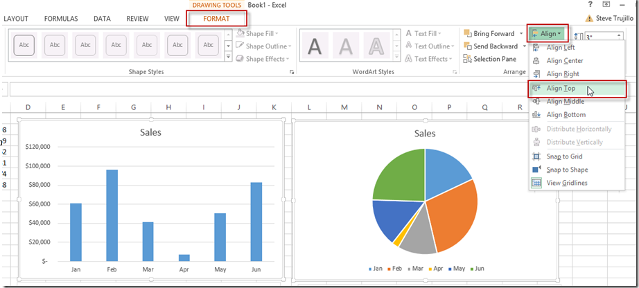
4) Choose the Format Ribbon, then choose the Align menu in the Arrange group and then pick your alignment type.
Note: You typically want to only pick the charts that will be aligned during a one plane. For instance, in this picture below, I would choose Align Top since the charts are on the top of my chart area. Then I would move around and choose the two right charts and align them right, then choose the two bottom charts and align them to the bottom and finally the two on the left with Align Left.
Video Tutorial
This embedded resource is unavailable in the restored edition.
So in the future, don’t drive yourself mad with trying to manually align your charts with your mouse. Use the Align feature instead. Now given that we may use the Align features in the Align menu, let me know if you ever use the other Align menu options like: Distribute Horizontally or Vertically or Snap to Grid or Snap to Shape. I am not sure how much these items may get used. Perhaps Distribute Vertically or Horizontally are used when people build swim lanes process flows in Excel. Not sure the best use cases for snap to grid or snap to shape, but let me know what you think in the comments below.
Steve=True


Reader discussion
Comments preserved from the original page. New comments are closed.
Reader
October 21, 2014 At 3:57 am
Great tip Steve. I use the align tools all of the time. I have added most of them to my QAT to access them easily.
Reader
October 21, 2014 At 6:30 am
Thanks Pete. Did you add all of the Align buttons or just a few? Send me a pic 🙂 Steve=True
Reader
October 21, 2014 At 6:53 am
On its way! 🙂
Reader
October 26, 2014 At 8:44 am
One thing I always do before aligning charts or objects is make sure they are all the same size. One being off by just a fraction of an inch can make all the work you’ve done aligning the objects for aesthetic reasons unsuccessful.
It might also be helpful to point out that when you use the align buttons, it aligns all selected objects with the one that is the furthest in that direction (ie: if you select align left, it will move all of the objects up so that the left edges align with the one that was the furthest to the left.)
Reader
October 28, 2014 At 8:16 am
Great points. Thanks DT! Steve=True
Reader
July 28, 2015 At 9:30 am
You can ctrl on all the graphs you are aligning and resize them at once. 🙂
Reader
July 28, 2015 At 10:26 am
Thanks for the great comment Tracey. Steve=True