First, I want to say thank you, because you are an Excel fan. Then again, maybe you are an Excel Geek? I know I am ![]() . So I read blogs and try to learn about everything Excel. Thank you for joining me in a quest to explore and unlock all Excel puzzles. In the meantime, I wanted to show you my recommendations for the “How would you do it?” segment.
. So I read blogs and try to learn about everything Excel. Thank you for joining me in a quest to explore and unlock all Excel puzzles. In the meantime, I wanted to show you my recommendations for the “How would you do it?” segment.
How did you do? Let me know in the comments below! Also, let me know if you were able to use this technique in your last company dashboard. Here is the Excel User question that was posed:
“I have data in this format
| A | B | C | |
|---|---|---|---|
| 1 | Project Name | Provider | Spend |
| 2 | APPLE | FRUIT | $ 73,460.68 |
| 3 | BURGER | FAST FOOD | $ 226,331.56 |
| 4 | HOTDOG | FAST FOOD | $ 328,968.64 |
| 5 | CHOCOLATE BAR | CONFECTIONARY | $ 11,611.08 |
| 6 | CARROT | VEGETABLE | $ 74,283.04 |
| 7 | CABBAGE | VEGETABLE | $ 93,143.96 |
| 8 | ONION | VEGETABLE | $ 74,283.04 |
| 9 | PEPPER | VEGETABLE | $ 70,799.56 |
| 10 | GARLIC | VEGETABLE | $ 48,601.80 |
| 11 | BREAD | CARBOHYDRATE | $ 23,220.60 |
| 12 | ROSEMARY | HERB | $ 159,088.80 |
I want to present it so that it looks like this (although obviously in real life would be in proportion to the numbers!):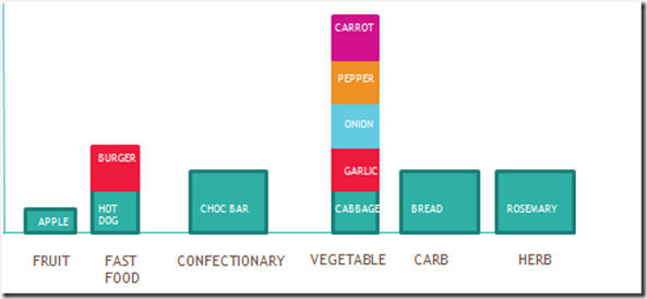
I’m really struggling – can anyone help? I would be very grateful.”
Well sadly, I never heard back from this forum poster ![]() . Maybe they had moved on by the time I saw their post and was able to answer their question. No worries mate, others can benefit from this question and maybe the users used it at a later date.
. Maybe they had moved on by the time I saw their post and was able to answer their question. No worries mate, others can benefit from this question and maybe the users used it at a later date.
I got a few great comments on alternate suggestions. I feel that everyone gravitates to a first answer and mine was different then theirs. Here is what I came up with:
My final chart looks like this: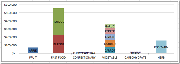
I think the Excel user may have gotten the scales a bit wrong ![]() . Look at the difference between my fast food column and theirs. Regardless, he said that the columns weren’t accurate. I think my chart looks good. So how can we do this type of chart. Here is one way. See the bottom of the post for an alternate solution.
. Look at the difference between my fast food column and theirs. Regardless, he said that the columns weren’t accurate. I think my chart looks good. So how can we do this type of chart. Here is one way. See the bottom of the post for an alternate solution.
The Breakdown
1) Setup your data in Rows
2) Create Chart and Switch Row/Column
3) Add Data Labels
4) Resize and Clean up Chart Junk
5) FAN ALTERNATE SOLUTIONS ![]() Check them out!
Check them out!
Step-by-Step
1) Setup your data in Rows
So you say the way the user had their data set up. It a great table for the data, but Excel won’t chart it the way we want. So we need to change the way we position the chart data so that Excel will make the graph we want. Here is how I positioned the Excel stacked column chart data table:
| A | B | C | D | E | F | G | H | I | J | K | L | |
|---|---|---|---|---|---|---|---|---|---|---|---|---|
| 15 | Provider | APPLE | BURGER | HOTDOG | CHOCOLATE BAR | CARROT | CABBAGE | ONION | PEPPER | GARLIC | BREAD | ROSEMARY |
| 16 | FRUIT | $ 73,461 | ||||||||||
| 17 | FAST FOOD | $ 226,332 | $ 328,969 | |||||||||
| 18 | CONFECTIONARY | $ 11,611 | ||||||||||
| 19 | VEGETABLE | $ 74,283 | $ 93,144 | $ 74,283 | $ 70,800 | $ 48,602 | ||||||
| 20 | CARBOHYDRATE | $ 23,221 | ||||||||||
| 21 | HERB | $ 159,089 |
Each row of data will represent a stacked column for the dashboard chart. This is why the Excel user had such issues trying to create their chart. So if you have problems creating a chart, try new and exciting ways to combine your data and Excel may then give you the graph you are looking to do.
2) Create Chart and Switch Row/Column
Now that we have our data setup correctly, creating the chart will be a piece of cake. So highlight the entire chart data table from the Provider label to the Rosemary value. Then go to the Insert Ribbon and choose the Column Chart button and the Stacked Column choice.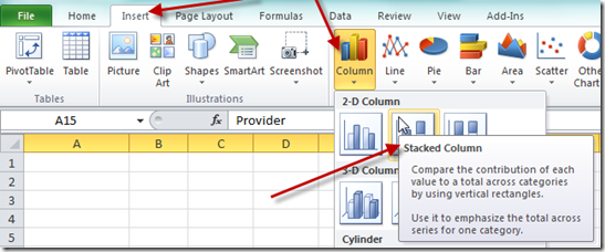
If you don’t know why you need to do this step, check out this post:
Why Does Excel Switch Rows/Columns in My Chart?
Your chart should look like this: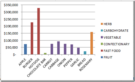
Now make sure you still have the chart selected and then go to the Design Ribbon and choose the Switch Row/Column button from the Data Group: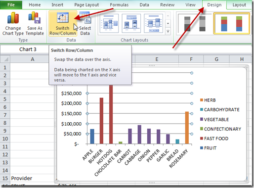
Your resulting chart should now look like this: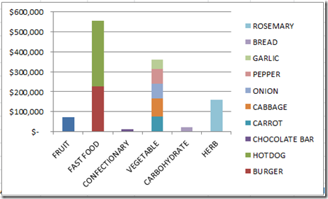
This chart now looks pretty close. All we need to do is to add the data labels and clean up the chart junk.
3) Add Data Labels
Here is where we need to do a lot of individual work. I haven’t found another way to do this any faster. If you know of a way to do this faster, please let me know in the comments below so that I can share it with everyone. ![]()
To add data labels, select the chart and then go to your Layout Ribbon and choose the Data Labels button and choose Center option. Your chart should now look like this: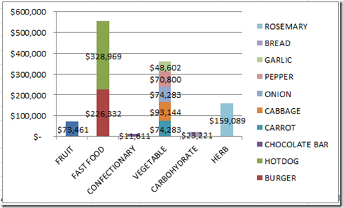
Not quite the labels we are looking to display, but we can fix it. First select any of the data labels that you see and then press CTRL+1 to bring up the Format Data Labels dialog box and change the Label Contains choice to Series Name instead of Value.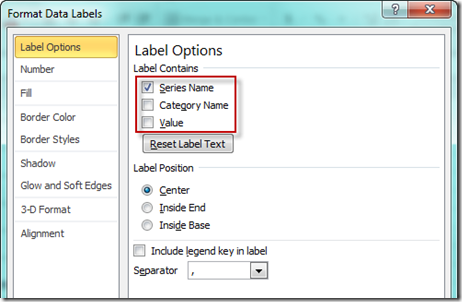
Now don’t close the Format Data Labels dialog box and just keep selecting the data labels and changing the Label Contains choice for each. Do this for every data point in the chart and your chart will now look like this: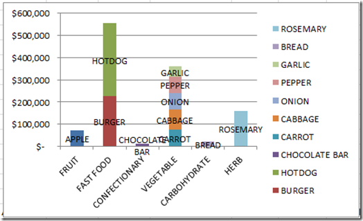
Almost done. Just a little chart junk cleanup.
4) Resize and Clean up Chart Junk
Excel is a hoarder when it comes to chart junk. So we need to delete it. So click on the legend and press the delete key. Then resize your chart to be a larger chart or decrease the size of the horizontal axis data label font size so that the horizontal axis shows the categories horizontally instead of at an angle. Your chart should now look like this: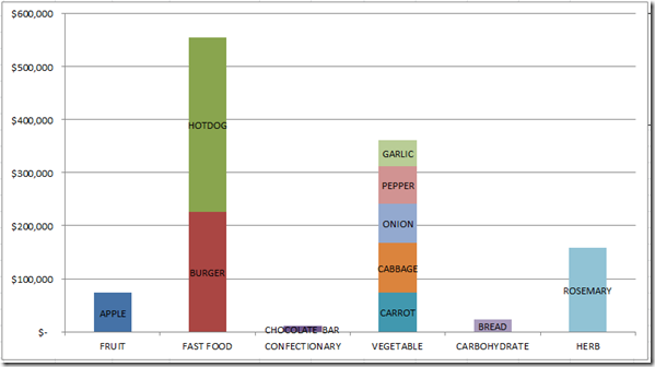
All I did was make the chart a lot larger in size so that the horizontal categories were displaying in a horizontal fashion. That is it. A simple change to the data and you can make this type of chart. However, I had a few fans that sent me their charts. The one below was very cool, so check it out.
5) FAN ALTERNATE SOLUTIONS ![]()
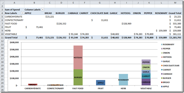
I don’t usually think about using a pivot table to create a chart as my first choice. However, a fan “Jake” sent me this chart. Jake set up his data so quickly by using a pivot table, that I think I will do this in the future. Will save me lots of key strokes. Below he created a pivot table of the data and then simply charted it. I think he still had to do the same label creation, but the setup of the data was much quicker.
Thanks Jake!
Thanks for being a fan and thanks to all the fans out there. More to come, as you can do almost anything in Excel!!
Video Tutorial
Here is the video demonstration of both techniques:
Steve=True


