Friday Challenge – Mimic Newspaper Chart Line Style in Excel
Hi All,
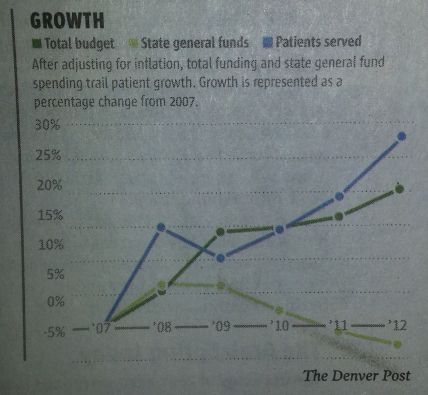
Here is a fun challenge that I thought you might like. I saw this chart in the Denver Post and I wondered how...
Terrible Chart Follow-up
Hi All,
Sorry my postings have been a little slow. I had several things come up. 1) I got hacked again and had to spend...
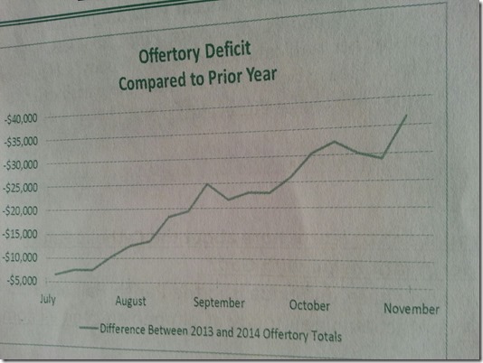
Terrible Chart Tuesday – What do you think of this chart?
Part of Excel Dashboard design and development should be to know what is right and what is just wrong with a chart or dashboard. ...
Colorado Snow Globe
Check out what I was seeing out side my back yard window this weekend. Looks like a real life snow globe.
Let me know what...
Friday Challenge Answers – The Boss Says…
I received some great responses from lots of fans. Thank you so much for all your great comments. I agree with most and my...
How-to Make an Excel Clustered Stacked Column Chart with Different Colors by Stack
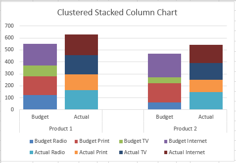
In a popular post, I showed you how to easily create a Clustered Stacked Column chart in Excel using Multi-Level Category Axis options.
Here is...
Friday Challenge – The Boss Says “Can you create some graphs?”
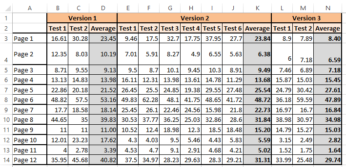
Here is the scenario that thrills Excel data analysts and sends chills down most employee’s spines:
Thursday afternoon: Your department sent out an Excel spreadsheet...
Excel 2013 Chart Bug
I think I found a bug in Microsoft Excel 2013. It is not a major bug, but annoying like most bugs.
Do you see the...
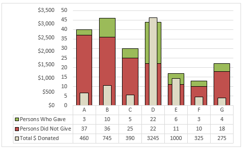
Friday Challenge Answers – Food Donation Excel Dashboard Chart
Last week we presented a chart challenge to see how you represent Food Donation data.
Don said that we should keep it simple and sent...
Friday Challenge – How Would You Chart It?
Today the ExcelDashboardTemplate.com Friday Challenge is up to you and your wildest imagination.
An Excel chart newbie posted this data set and wasn’t sure the...

