How-to Make a USA Today InfoGraphic Chart In Excel
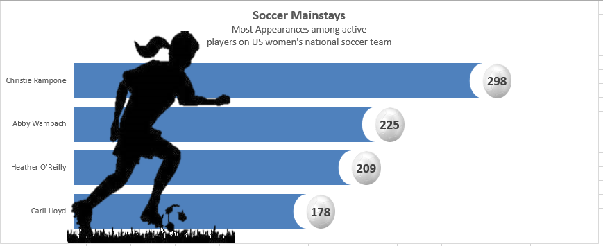
In a recent issue of USA Today, the following infographic was posted on the U.S. women’s national soccer team player appearances.
I liked it and wondered if I could make a similar chart using...
How-to Line Up Your Excel Worksheet Embedded Charts
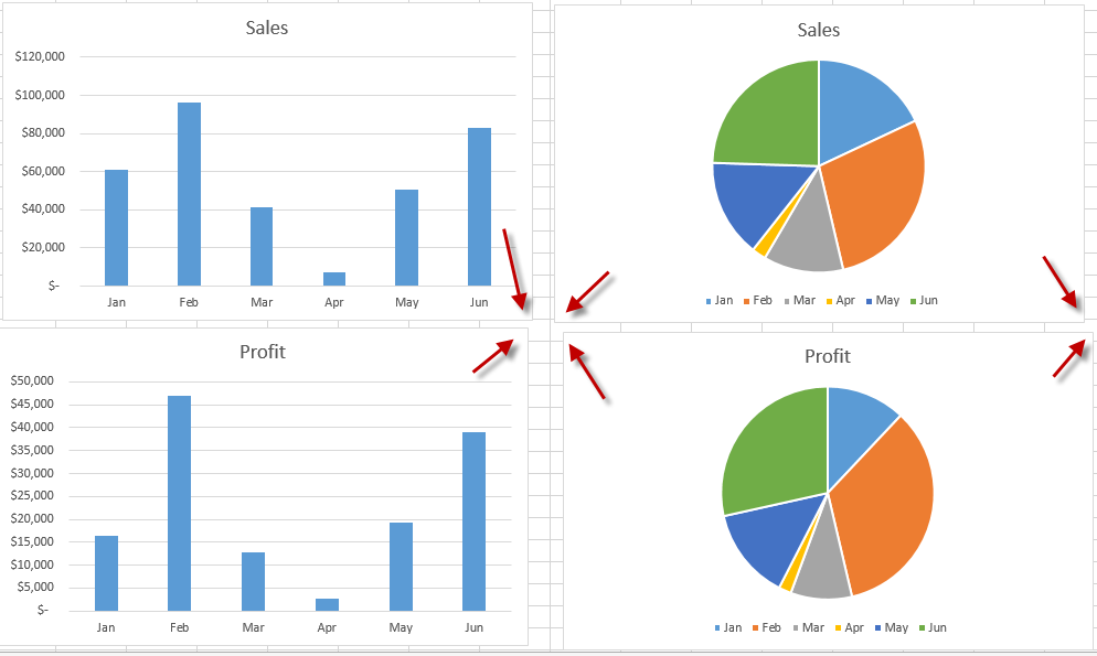
Have you ever created a lot of charts in an Excel Worksheet and drove yourself crazy trying to line the charts up?
Notice how the charts above are all not in perfect alignment? Well, here...
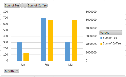
Stopping Excel Pivot Chart Columns from Overlapping When Moving Data Series to the Second...
A fan of the blog asked a question about this post:
Stop Excel From Overlapping the Columns When Moving a Data Series to the Second Axis
They wanted to know how to do it with a...
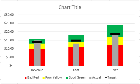
How-to Make an Excel Chart with 3 Different Column Widths (Bullet Chart Option 2)
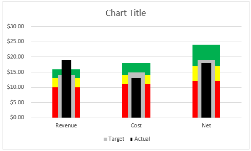
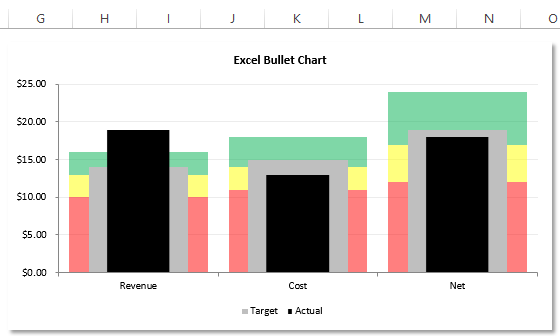
In are recent post, I showed you how to create a Bullet Chart in Excel. Pete, then sent me another way to create a Bullet Chart in Excel. But the really incredible thing is...
Friday Challenge – Recreate Pete’s Bullet Chart
Our good friend Pete sent me his take on the Recent Bullet Chart posting. I was dumb founded on how he created it. In fact, if he hadn't told me how he did it,...
How-to Make an Excel Bullet Chart
Executives and managers love to see gauge charts in their Excel Dashboards. However, gauge charts may confuse or mislead the dashboard readers. For instance, if you have a gauge range from 1-100, what do...
How-to Use Data Labels from a Range in an Excel Chart
Excel 2013 has some cool features. If you were not aware, here is an awesome Chart Data Label option that you now have when you upgrade to Excel 2013. I know that this wasn’t...
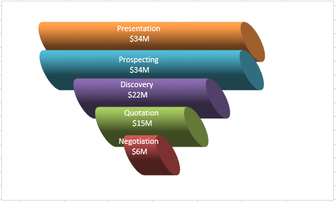
Don’s Take on the Better Sales Funnel Chart
I got a positive comment from Don and he liked the Better Excel Sales Pipeline / Sales Funnel Chart.
But....he thought it lacked ***flash***!
So he came up with an updated version as you can see...
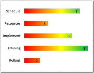
New Take on the Excel Project Status Spectrum Chart
Leonid, a wonderful reader of our website, sent in a new take on my Excel Project Status Spectrum Chart. Here is what his looks like:
I think it is cool and a BIG Thanks to...
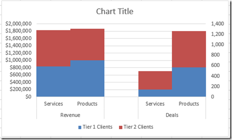
How-to Create a Stacked Clustered Column Chart with 2 Axes
In response to another post of mine, EC wrote:
“My issue: This site has been really helpful so far! I have a follow up question. Could I create a secondary axis for one of the...

