How-to Make a BETTER Excel Sales Pipeline or Sales Funnel Chart
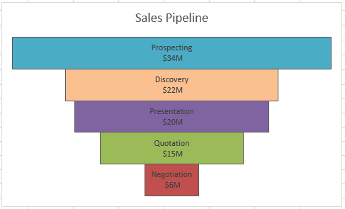
Learn how to make an accurate sales pipeline in Excel. In previous posts, I have showed you how to make a sales funnel chart...
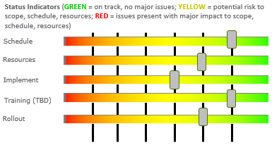
How-to Make an Excel Project Status Spectrum Chart
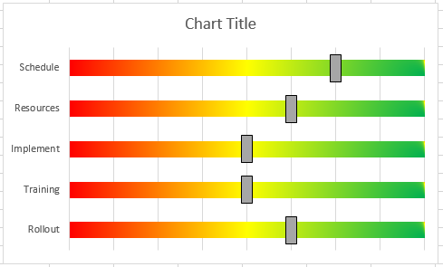
Here is the long awaited demonstration of a recent Friday Challenge.
The challenge was to recreate a Project Management Status Chart that I saw on...
Chart Increase at Time Interval in Excel
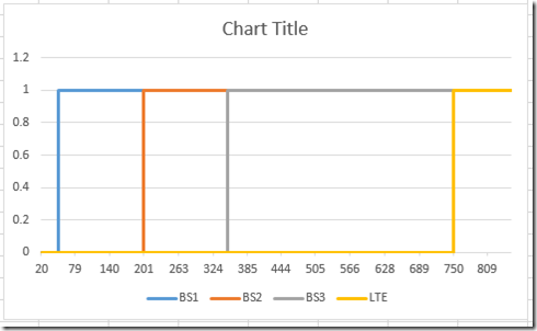
Here is my answer to the most recent Friday Challenge. Would welcome any comments below on what you think (flaws, likes, thoughts…)
In case you...
Friday Challenge Answers – Graph Increase at Time Interval
Hello everybody. We had a two answers submitted by our friends Don and Pete. Surprisingly, they had the same thought.
They both thought that the...
Friday Challenge – Graph Increase at Time Interval
Hi All, I have been traveling and very, very sick this week. I am coughing almost every minute or so. Therefore, I was unable to...
Friday Challenge – Recreate an Excel Project Status Spectrum Chart
I am always looking for charts or anything that I can put into an Excel chart. In fact, I just skim the Wall Street...
Double Helix DNA Strand Excel Chart
Well, looks like the last Friday Excel Chart Challenge inspired people to get cracking and creative.
1) Don “Nailed it”. That is a direct quote I...
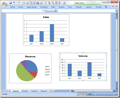
How-to Add Multiple Charts to an Excel Chart Sheet
In past versions of Excel, the default was that your new chart was put into a chart sheet.
You can learn more about chart sheets...
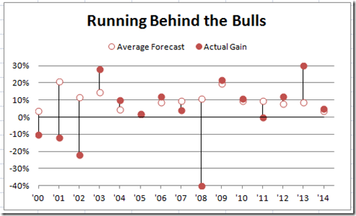
How-to Make a Wall Street Journal (WSJ) Double Lollipop Chart in Excel
In our last Friday Challenge, I proposed making a Double Lollipop Chart seen in the Wall Street Journal (WSJ).
Here is what our final chart...
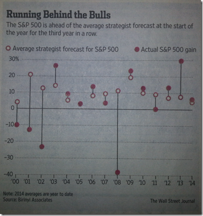
Friday Challenge – Recreate this WSJ Chart
I thought I would give you all something to do before we finish the final posting on Excel Chart Sheets.
So I have been traveling...

