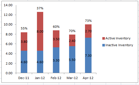
How-to Put Percentage Labels on Top of a Stacked Column Chart
There are times when you are creating your Excel Dashboard Design that you desire something that does not come naturally with the Excel Tools...
FUN Chart (Happy Mother’s Day!)
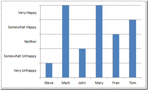
Recently I showed you one way that you can make Vertical Categories in an Excel Chart. (see How-to Make Categories for Vertical and Horizontal...
How-to Select Data Series in an Excel Chart when they are Un-selectable?
When I first learned to make Excel charts, I was taught to select the chart and then select the data series with my mouse. ...
Case Study: Executive Dashboard Chart Creation – Follow-up
The Problem
In a recent post:
“Case Study: Executive Dashboard Chart Creation” (https://www.exceldashboardtemplates.com/?p=1612)
I presented some basic data that you may have in your company that you...
How-to Make Categories for Vertical and Horizontal Axis in an Excel Chart
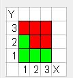
There are times in your Excel dashboard career that your boss will ask you to create an Excel Chart with category values for both...
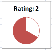
Make a Pie Chart Rating for Excel Dashboard Chart Templates
In a recent forum post, a dashboard user was asking how they can turn a decimal like 1.5 out of a 3.0 possible into...
How-to Add Custom Labels that Dynamically Change in Excel Charts
Have you ever wanted to have a different data point label in your Excel Chart than what is offered by the Standard Excel Dialog...
Case Study: Executive Dashboard Chart Creation
When building executive dasboards using Excel, you have to make the dashboard design choices that will assist your executives and the company in understanding...
How-to Plot Building Wall UR Value in an Excel XY Scatter Chart
In an Excel Help Forum, an engineer wanted to know how to chart the following data:
The data would need to be plotted like on...
Charting Specifications and Limits for Excel 2003, 2007 and 2010
Have you ever wondered how many data series you can actually add to an Excel chart? Well there are limits. Recently an Excel Client...

