Don’t worry, Excel is not changing your chart to a Stacked Clustered Column Chart or Stacked Bar Chart when you move a data series to the secondary axis. And here is how to fix it.
The Problem:
With this data set:
| A | B | C | |
|---|---|---|---|
| 1 | Tea | Coffee | |
| 2 | Jan | 300 | 1000000 |
| 3 | Feb | 700 | 5000000 |
| 4 | Mar | 300 | 5000000 |
You created a 2-D Clustered Column Chart
Then, because your data series is not the same scale, so, you decide to create 2 vertical axis’ so that the scales are distinct for the two data series. Then you move the tall orange columns to the secondary axis.
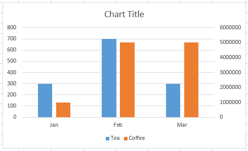
But it looks like Excel made it a Stacked Colum Chart How can I fix it?
This is the chart I really wanted:
The Breakdown
Excel is plotting your data on two different axis in the same space. So they will overlap. In order to not have them overlap, we need to add a pad space to push the tea column left and the coffee column right. (Thanks to Maruf for this graphic).
1) Create Chart Data Series
2) Insert 2 Columns Between Tea and Coffee
3) Highlight Data Range and Create 2-D Clustered Column Chart
4) Switch the Rows/Columns in Your Chart
5) Move Pad 2 Data Series to the Secondary Axis
6) Move Coffee Data Series to the Secondary Axis
7) Delete Pad Tea and Pad Coffee Legend Entries
Step-by-Step
1) Create Chart Data Series
2) Insert 2 Columns Between Tea and Coffee

3) Highlight Data Range and Create 2-D Clustered Column Chart
Your chart will look like this:
4) Switch the Rows/Columns in Your Chart
Click on your Chart and then go to the Design Ribbon and Press the Switch Row/Column button in the Data Group:

If you don’t know why you have to do this, check out this link:
Why Does Excel Switch Rows/Columns in My Chart?
Your chart will now look like this:
5) Move Pad 2 Data Series to the Secondary Axis
Select the Pad Coffee data series in the chart. If you can’t select it, check out this post:
How-to Select Data Series in an Excel Chart when they are Un-selectable?
or this Link:
The Quickest Way to Select an Data Series in an Excel Chart
Then Press Ctrl+1move that series to the Secondary Axis
Your chart won’t look any different since there is no data in the empty Pad Coffee Series.
6) Move Coffee Data Series to the Secondary Axis
Now repeat step 5 for the Coffee data series (column) and move it to the secondary axis.
Your chart will now look like this:
7) Delete Pad Tea and Pad Coffee Legend Entries
We are almost done. All we need to do now is remove the Pad Tea and Pad Coffee legend entries.
To delete the Legend entries, do the following:
a) Select the Chart
b) Select the Legend
c) Select the Legend Entry for Pad Tea
d) Press the delete key
e) Repeat A-D steps for Pad Coffee legend entry
Here is a cool post you may have missed about legend entries:
Tips and Tricks – Longer Legend Color Bars in Excel Charts
Here is what your final chart will look like:
Video Demonstration
Here is a detailed video tutorial showing you how to stop Excel from converting your converting your clustered column chart into a stacked column chart (even though we now know that it is just overlapping):

Sample Excel Download File
Here you can download free the sample chart:
How-to-move-a-data-series-to-the-second-axis-and-not-overlap-the-columns.xlsx
Congrats to Peter, Don and Maruf who were successfully able to make the final chart. Also, don’t forget to comeback as we will be showing you the Excel Super Bowl Dashboard Entries
Steve=True


