Tag: Excel
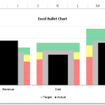
How-to Make an Excel Chart with 3 Different Column Widths (Bullet Chart Option 2)
In are recent post, I showed you how to create a Bullet Chart in Excel. Pete, then sent me another way to create a...
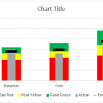
Friday Challenge – Recreate Pete’s Bullet Chart
Our good friend Pete sent me his take on the Recent Bullet Chart posting. I was dumb founded on how he created it. In...
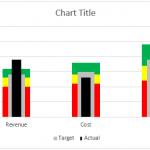
How-to Make an Excel Bullet Chart
Executives and managers love to see gauge charts in their Excel Dashboards. However, gauge charts may confuse or mislead the dashboard readers. For instance,...
How-to Use Data Labels from a Range in an Excel Chart
Excel 2013 has some cool features. If you were not aware, here is an awesome Chart Data Label option that you now have when...
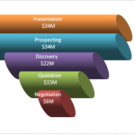
Don’s Take on the Better Sales Funnel Chart
I got a positive comment from Don and he liked the Better Excel Sales Pipeline / Sales Funnel Chart.
But....he thought it lacked ***flash***!
So he...
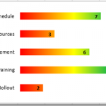
New Take on the Excel Project Status Spectrum Chart
Leonid, a wonderful reader of our website, sent in a new take on my Excel Project Status Spectrum Chart. Here is what his looks...
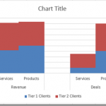
How-to Create a Stacked Clustered Column Chart with 2 Axes
In response to another post of mine, EC wrote:
“My issue: This site has been really helpful so far! I have a follow up question....
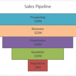
How-to Make a BETTER Excel Sales Pipeline or Sales Funnel Chart
Learn how to make an accurate sales pipeline in Excel. In previous posts, I have showed you how to make a sales funnel chart...
How-to Make an Excel Project Status Spectrum Chart
Here is the long awaited demonstration of a recent Friday Challenge.
The challenge was to recreate a Project Management Status Chart that I saw on...
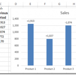
Chart Increase at Time Interval in Excel
Here is my answer to the most recent Friday Challenge. Would welcome any comments below on what you think (flaws, likes, thoughts…)
In case you...

